I’ve stripped out CSS for CSS Naked Day.
very cool! not surprised your page looks great even on mobile :)
I added some bits about hand sewing on my site today
Thanks, @xandra. Testing in Lynx helps, but let’s be honest. It’s not as hard as some people think. You probably knows that all it takes to make page as bare-bones as mine responsive and mobile-friendly is a single meta tag in <head>:
<meta name="viewport" content="width=device-width, initial-scale=1">
Everything else is a matter of progressive enhancement. For example, if I want a certain layout on desktops and laptops I should use media queries to restrict them to devices that are likely to be desktop computers or laptops. For example:
@media only screen and (pointer: fine) { }
Of course, the media query above isn’t compatible with browsers’ “responsive design modes”, which depends on media queries targeting screen sizes.
However, I don’t trust screen-size breakpoints. We have high-end smartphones with 4K displays, but I still wouldn’t want more than one column of text to display on such a device because even in landscape mode it would probably look cramped. I would rather use screen-size breakpoints to adjust the base font size in a stylesheet that uses rem units for font sizing, like so:
html {
  font-size: medium; /* In most browsers, 'medium' is 16px. */
}

@media only screen and (min-width: 1280px) {
  html {
    font-size: large;
  }
}

@media only screen and (min-width: 1920px) {
  html {
    font-size: x-large;
  }
}
After CSS Naked Day I decided that I liked not having my website confined to a narrow column of text, but thought a bare page was a bit too bare. So I whipped up this stylesheet.
html {
  font-size: medium;
}

body {
  margin: 0 1rem;
  padding: .2rem 0 .5rem;
  font-family: 'atkinson hyperlegible', -apple-system, BlinkMacSystemFont, 'avenir next', avenir, 'segoe ui', 'helvetica neue', noto, 'noto sans', roboto, cantarell, ubuntu, helvetica, arial, sans-serif;
  font-size: 1rem;
  line-height: 1.62;
  background: ghostwhite;
  color: black;
}

pre, code, time {
  font-family: menlo, monaco, 'noto mono', 'noto sans mono', 'cascadia code', consolas, 'liberation mono', 'lucida console', monospace;
}

hr {
  margin: 1rem 0;
  border: 1px solid black;
}

pre {
  white-space: pre-wrap;
  word-wrap: break-word;
}

figure > pre {
  background: aliceblue;
  padding: .5rem;
}

h1, h2, h3, summary, footer {
  line-height: 1.2;
}

img, video {
  max-width: 100%;
  height: auto;
  border: 2px solid black;
  box-shadow: 5px 5px 2px rgba(0, 0, 0, .3);
}

summary {
  margin: 1rem 0;
  cursor: pointer;
}

dt, figcaption, summary, caption, th, time, code, .current {
  font-weight: bold;
}

header > h1 {
  margin: 1rem 0;
}

header > p {
  margin: 0;
  font-weight: bold;
  font-style: italic;
}

footer > figure, figure > blockquote {
  margin: 0 !important;
}

blockquote {
  border-left: 4px solid black;
  padding-left: 1rem;
}

blockquote, .serif-font {
  font-family: 'iowan old style', 'apple garamond', baskerville, 'times new roman', 'droid serif', times, 'source serif pro', serif, 'apple color emoji', 'segoe ui emoji', 'segoe ui symbol';
}

a {
  color: blue;
  text-underline-offset: .35rem;
}

small > a {
  text-underline-offset: .3rem;
}

a:focus {
  color: red;
  outline: red;
}

a:hover, a:visited:hover {
  color: green;
}

a:active {
  color: skyblue;
}

a:visited {
  color: purple;
}

details[open] > summary {
  padding-bottom: 1rem;
  border-bottom: 2px solid black;
}

table {
  margin: 1rem 0;
  border-collapse: collapse;
}

td, th {
  border: 2px solid black;
  text-align: left;
  vertical-align: top;
  padding: 0.5rem;
}

th {
  background-color: aliceblue;
}

tr:nth-child(even) > td {
  background-color: aliceblue;
}

table caption {
  text-align: left;
  margin: 0.5rem 0;
}

.current::after {
  content: "  (current page)";
}

@media only screen and (pointer: fine) {
  html {
    font-size: large;
  }

  body {
    margin: 1rem 4rem;
  }

  li {
    margin: .2rem 0;
  }
}

@media print {
  html {
    background: white;
  }

  body {
    background: white;
    color: black;
	max-width: none;
    font-size: 12px;
    font-family: serif;
  }

  * {
    color: white;
    box-shadow: none !important;
  }
}
Added descriptions to some of my favorite music albums:
Also, like a couple weeks ago, I expanded my preferred formats page to explain not only which formats I prefer but also why I prefer them so it doesn’t sound like I’m pulling them out of my ass:
I agree with you regarding UTF-8 and ISO-8601. Though I often have to convert dates to RFC 822 for use in RSS feeds. (time to switch to Atom?)
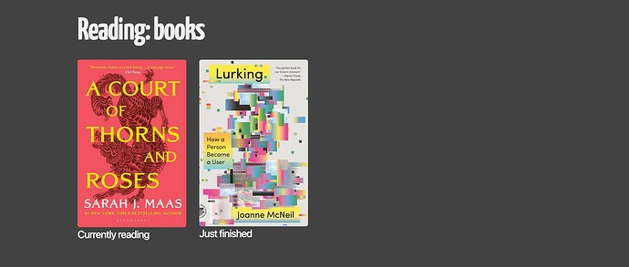
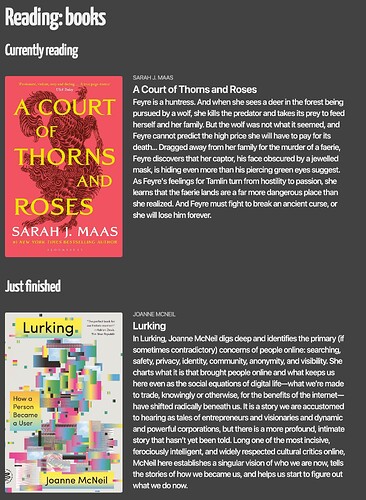
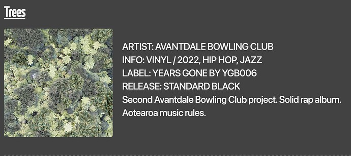
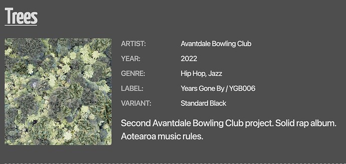
Gave my recordshelf some love today by organising the info in a nice grid.
Before
After
I’m going to take a look at creating filterable tags from the genres…
Looks like the new CSS isn’t loading, uh-oh ![]()
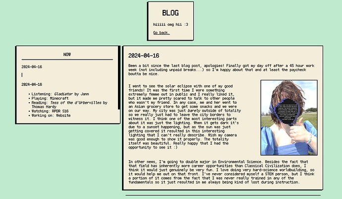
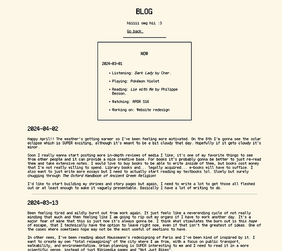
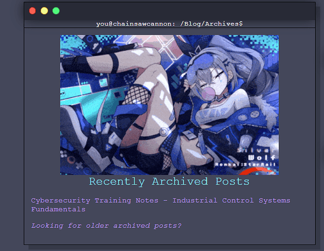
I recently added a Blog section (finally). Spent late night doing some revisions with some of the resources from the resource list on the board, will definitely research adding fancy stuff later but for now I have a pretty basic site. https://chainsawcannon.neocities.org
Did yet another overhaul to my site for the millionth time, but this time I used Hugo to build it! So far I’ve been learning new things as I set up my site, and I hope to get it to a more usable and more pretty-looking state in the future. I think I’d like my site to be a blog/gallery hybrid by the time I finish up polishing the layout.
Also using Hugo is making me want to migrate my blogs from Tumblr to Leprd ![]()
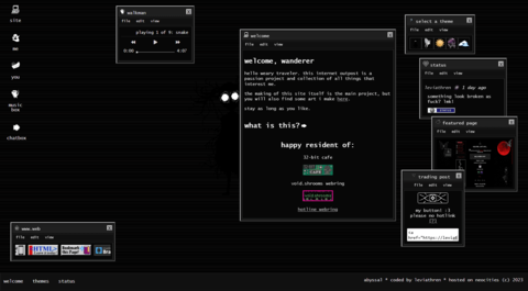
Updated my homepage to its fourth era today.
New
Old
Now I just gotta update my layout archive and rss feed.
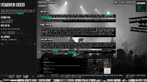
made my website look prettier :D top is after, bottom is before. besides that, added stuff to my erenia page and some other thangs i dont really remember
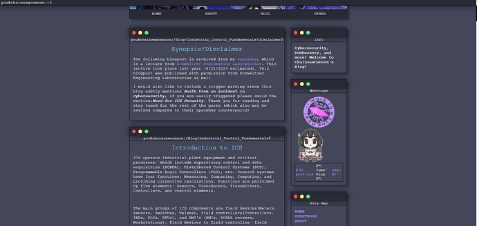
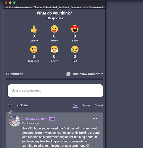
Started to archive blogs from my spacehey… finally… I also added a comments system for my blog via Disquis
I added some more links to my Linkware Websets page. Because clearly I don’t have enough! My favorite out of this set of links are these 2 Winnie-the-Pooh themed sets. One set has a more classic looking Pooh, the other one has the cute little bugs that decorate the pages of the books.
I also updated my 2024 Reading Log - I added March’s entries.
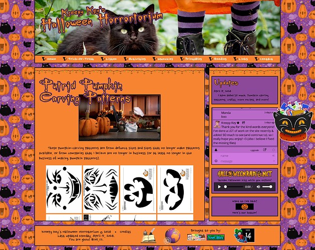
I made what I think is a really cute new header for my Charm Bracelet Pixel Club page by using charm graphics from one of the sites on my graphics page.
I have all my pixel club images in one folder. I have a LOT of images for some of the clubs/cliques. It’s getting to be a hot mess. My next big project is to create separate folders for each pixel club and move the images.
I turned https://thiscat.rocks/ from a “useless” website into a personal homepage for my cat, Baxter. This is really my first handmade website out on the internet and I had a lot of fun making it. With time I hope to learn more and of course make a homepage for myself as well ![]()
This is great! The web needs more of these
I’ve spent the last few days playing with various search engnes, espcially those that are speciaized or able to search for old personal web sites - Alternative Search Engines
