I took down the fall theme and put up a seasonal one which is different from last year’s! I repurposed an old linkware webset. It came with instructions on how to set up everything in tables, like we used to do back in the day, but thanks to W3 schools I found out how to wrangle the left side border without one and also to have that side border background + a page background at the same time.
3 Likes
Improved my website’s footnotes after receiving tips from @hedy in an email for how to make them even better. I have also updated my article about accessible footnotes with information about how to implement these methods:
4 Likes
I’m going to adapt this bit of CSS for my own site, @Leilukin.
a[href^="http"]:not([href*="leilukin.com"]):not(:has(img, svg, picture)),
.external-link { padding-right: var(--sz-external-link); }

a[href^="http"]:not([href*="leilukin.com"]):not(:has(img, svg, picture))::after,
.external-link::after {
    position: absolute;
    content: "";
    display: inline-block;
    width: 1em;
    height: 1em;
    margin-left: 0.3em;
    background-color: currentColor;
    mask-image: url("data:image/svg+xml,%3Csvg xmlns='http://www.w3.org/2000/svg' viewBox='0 0 512 512'%3E%3C!--!Font Awesome Free 6.5.2 by @fontawesome - https://fontawesome.com License - https://fontawesome.com/license/free Copyright 2024 Fonticons, Inc.--%3E%3Cpath d='M320 0c-17.7 0-32 14.3-32 32s14.3 32 32 32h82.7L201.4 265.4c-12.5 12.5-12.5 32.8 0 45.3s32.8 12.5 45.3 0L448 109.3V192c0 17.7 14.3 32 32 32s32-14.3 32-32V32c0-17.7-14.3-32-32-32H320zM80 32C35.8 32 0 67.8 0 112V432c0 44.2 35.8 80 80 80H400c44.2 0 80-35.8 80-80V320c0-17.7-14.3-32-32-32s-32 14.3-32 32V432c0 8.8-7.2 16-16 16H80c-8.8 0-16-7.2-16-16V112c0-8.8 7.2-16 16-16H192c17.7 0 32-14.3 32-32s-14.3-32-32-32H80z'/%3E%3C/svg%3E");
    mask-repeat: no-repeat;
    mask-size: 90%;
    transform: translateY(0.25em);
}
I was using a Unicode arrow to mark off-site links, but this SVG really is nicer.
Here’s my implementation, which uses rem units for responsive sizing and also has hover/focus effects adapted from @eladnarra:
a:focus:not(:has(img, svg, picture)), a:hover:not(:has(img, svg, picture)), a:visited:hover:not(:has(img, svg, picture)) {
    font-weight: bold;
    color: CanvasText;
    outline: thick dashed CanvasText;
    outline-offset: .25rem;
    text-decoration: none;
}

a[href^="http"]:not([href*="starbreaker.org"]):not(:has(img, svg, picture)), .external-link {
    padding-right: 1.25rem;
}

a[href^="http"]:not([href*="starbreaker.org"]):not(:has(img, svg, picture))::after, .external-link::after {
    position: absolute;
    content: "";
    display: inline-block;
    width: 1rem;
    height: 1rem;
    margin-left: 0.3rem;
    background-color: CanvasText;
    mask-image: url("data:image/svg+xml,%3Csvg xmlns='http://www.w3.org/2000/svg' viewBox='0 0 512 512'%3E%3C!--!Font Awesome Free 6.5.2 by @fontawesome - https://fontawesome.com License - https://fontawesome.com/license/free Copyright 2024 Fonticons, Inc.--%3E%3Cpath d='M320 0c-17.7 0-32 14.3-32 32s14.3 32 32 32h82.7L201.4 265.4c-12.5 12.5-12.5 32.8 0 45.3s32.8 12.5 45.3 0L448 109.3V192c0 17.7 14.3 32 32 32s32-14.3 32-32V32c0-17.7-14.3-32-32-32H320zM80 32C35.8 32 0 67.8 0 112V432c0 44.2 35.8 80 80 80H400c44.2 0 80-35.8 80-80V320c0-17.7-14.3-32-32-32s-32 14.3-32 32V432c0 8.8-7.2 16-16 16H80c-8.8 0-16-7.2-16-16V112c0-8.8 7.2-16 16-16H192c17.7 0 32-14.3 32-32s-14.3-32-32-32H80z'/%3E%3C/svg%3E");
    mask-repeat: no-repeat;
    mask-size: 90%;
    transform: translateY(0.25rem);
}
2 Likes
Among a few other small changes, I’m working on my about page right now
The actual about me part is blank so far, but I’ve started a little stamp collection!
On the same page I’ve also added some Picrews that I’ve made, and I’m happy with how they look together. If you have any other recommendations for Picrews, let me know
4 Likes
I’m still working on my 2024 redesign, trying to get it published before it becomes 2025!
2 Likes
I definitely relate to this. I’m trying to do the same.
Doing a small amount of CSS and shortcode work, tidied up a few layouts and centered the various buttons and blinkies on my ring pages.
I’m also working on a resdesign, though it’d be fairer to call it finishing a design, seeing how I really just slapped everything together before launch. I’m at a complete loss as to where to start, I have a few drawn ideas but none of them seem right.
I’m trying to decide whether to keep my current 1280px max width or slim it down, it feels too wide but I don’t like the skinny single column modern site look.
Maybe a 960px content column and a 320px menu/admin column on one side?
Thanks for the shoutout; so glad to have helped! ![]()
2 Likes
Every time I see images with that style it reminds me the great low tech magazine website: https://solar.lowtechmagazine.com/
2 Likes
Haha that is among my favourite sites, and a major inspiration! Though https://princss.online/ is also a contributing factor!
My site rebuild is coming along nicely. But I ended up cleaning up an old post from 2016.
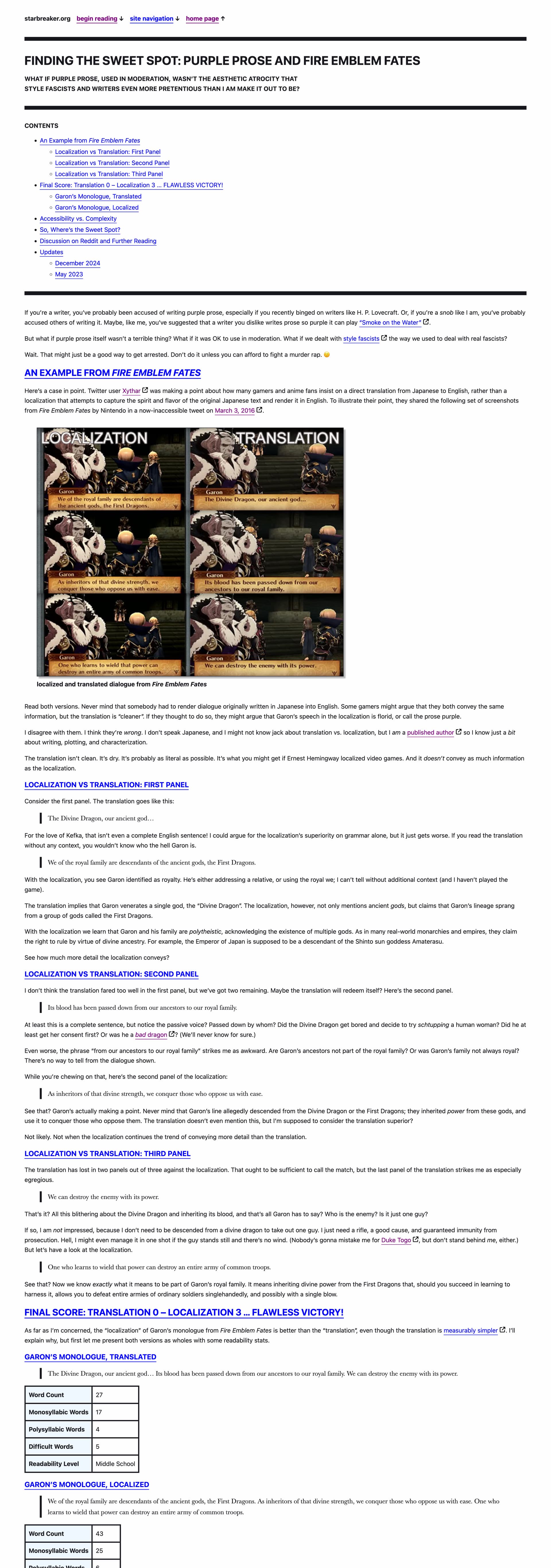
I hadn’t played Fire Emblem Fates in its entirety; I just saw this tweet and people griping about “purple prose” in JRPG localizations, and ended up writing this. I bet a lot of the people who insist on a direct translation over a localization hate the English-language version of Final Fantasy XIV.
2 Likes
I’ve got the new version of my website staged at https://new.starbreaker.org/ if anybody wants to poke around.
6 Likes
Doing a bit more work on templates today.
Corner only borders. (shamelessly stolen from here)
With some issues; it doesn’t play nice with my image classes and trying to have a different background colour for the element its surrounding for contrast’s sake gives this ugly effect.

Also trying to move away from my overly edgy colour scheme at some point before Christmas.
2 Likes
Looks good, are links going to be black on hover in the final version?
Thanks.
Links will remain black with an outline on hover/focus in the final version unless I come up with something better.
I suspect the question may have been about dark-mode. In light-mode, the black works very well. In dark-mode, the link essentially becomes invisible. (I poked around). This could very well be intended, but figured I’d address it in case it’s an oversight.
I didn’t even think of that; I must have taken the question too literally.
Thanks. Looks like I’ve got some more work to do there.
In dark mode it should be white text with a white outline. I’ll have to do some more testing to determine how I had fouled up.
1 Like
Yeah this is what I actually meant, it defaults to dark mode on my browser and links look like this when hovered:
Which is unreadable at normal font sizes.
Should’ve been clearer soz, I didn’t realise that it’s probably intended to be light mode first.
No, @Frankie, all the mistakes are on my end.
- I took your question too literally.
- My stylesheet should work equally well in light mode and dark mode.
- Using
CanvasTextto specify a color doesn’t seem to work as I had expected in dark mode, so it probably wasn’t a good idea for me to use that.
I just pushed a new stylesheet, so if you do a force refresh things should work properly now.
1 Like