What are your Favorite Fonts?

I love the Voltaire font, and it was used on the cover of my (out-of-print) first novel, Without Bloodshed, but it isn’t really suitable for websites because it doesn’t have bold or italic styles.

My stylesheet uses Atkinson Hyperlegible for most text if you have it installed locally. Otherwise, I use a system font stack built from fonts commonly installed on Windows, macOS, and Linux.

This approach doesn’t necessarily lend itself to having a distinctive visual identity, but it’s better for performance, doesn’t use as much data (which is important for mobile visitors), and blocks one vector for user tracking by avoiding the use of Google Fonts or similar providers.

I really like Atkinson Hyperlegible! I was originally thinking of just using a system font stack for my site, but I’ve been thinking I might include Atkinson Hyperlegible as a self-hosted web font for body text. Using it if the user has it installed locally is an interesting option between those…

I had thought of self-hosting that font as well, but decided against it because I don’t want to use web fonts if I can avoid it. I would rather let your browser use locally installed fonts for better performance and reduced data usage, which I consider to be important accessibility issues as well.

It was easy for me to place Atkinson Hyperlegible at the top of my default font stack so that it’s there for those who want it. If similar monospaced and serif fonts existed, I’d put them on the tops of their respective stacks, too. It doesn’t cost me anything, and if those who need these fonts have them installed locally then my site is a bit easier for them to read.

This is how I implemented my font stacks (pulling the relevant bits from my stylesheet.

:root {
  --size: medium;
  --sans-stack: 'atkinson hyperlegible', -apple-system,BlinkMacSystemFont, 'avenir next', avenir, 'segoe ui', 'helvetica neue', helvetica, cantarell, ubuntu, roboto, noto, arial, sans-serif;
  --mono-stack: menlo, 'cascadia code', consolas, monaco, 'liberation mono', 'lucida console', monospace;
  --serif-stack: 'iowan old style', 'apple garamond', baskerville, 'times new roman', 'droid serif', times, 'source serif pro', serif, 'apple color emoji', 'segoe ui emoji', 'segoe ui symbol';
  --body-font: 1.2rem/1.62 var(--sans-stack);
}

html {
  font-size: var(--size);
}

body {
  font: var(--body-font);
}
1 Like

i havent really got the hang of using fonts yet. annoyingly enough, i can be really picky about them but also dont have a good eye for knowing which ones i like until i actually see them on my page

some of my current favorites are fontstuck extended (fontstruct page) and courier new. since fontstuck is just a pixelated version of courier new, they tend to look really good together with fontstuck being a punchy title/accent font and courier new being a paragraph/general text font

i also like arial, which is funny because around middle school i had an active aversion to it. like i would refuse to write in a document with arial as the font. i, having superior tastes (lighthearted sarcasm), preferred to use handwriting fonts with bright colors and/or highlights

a recent font i found that i like is jacquarda bastarda (fonts.google, github). it looks really cool but its not very legible so its best for aesthetic things and not anything thats actually important to read

comic sans is a semi-ironic favorite of mine. its genuinely a good font for legibility though. opendyslexic has a lot going on with it so its overwhelming to me, i think for accessibility i prefer atkinson hyperlegible, or just giving the users the ability to control the font of a site

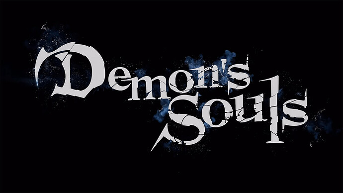
Because it looks like the Demon’s Souls logo

4 Likes

i don’t know that i’d consider either of these fonts favorites, but i want to share two that i’ve been delighted by recently.

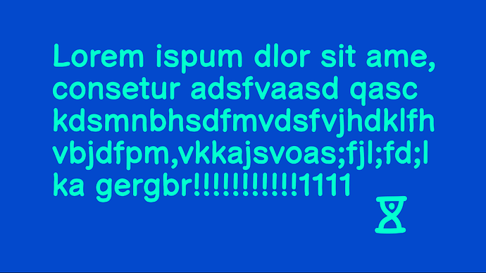
first, comic helvetic, which is meant to be a hybrid of comic sans and helvetica:

second, ouvrières, which makes each letter look like ants crawling in a line:

Click to see the bug font

(i may have to find a use for this one, hehe)

6 Likes

I use JetBrains Mono too! I also currently use it on my website.

Victor Mono is one of my favorite fonts because it’s one of two that I know of that has both programming ligatures and cursive italics (the other being Dank Mono). Plus, it shares my initials.

5 Likes

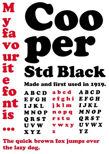
I know it’s outdated and overused, and perpetually associated with the 70’s, but Cooper Black will probably always have my heart.

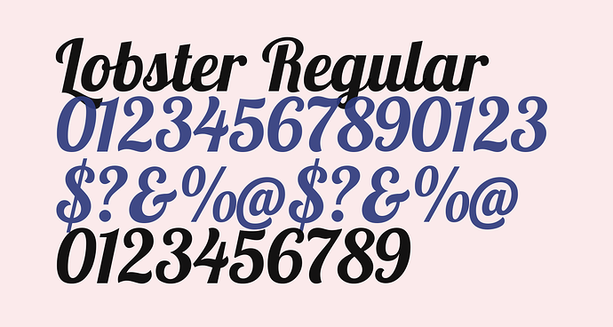
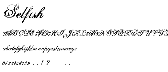
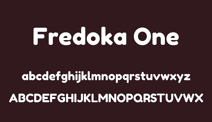
Other favorites are Lobster, Fredoka One, and I’ll always love Selfish since it’s just so early 2000’s to me.


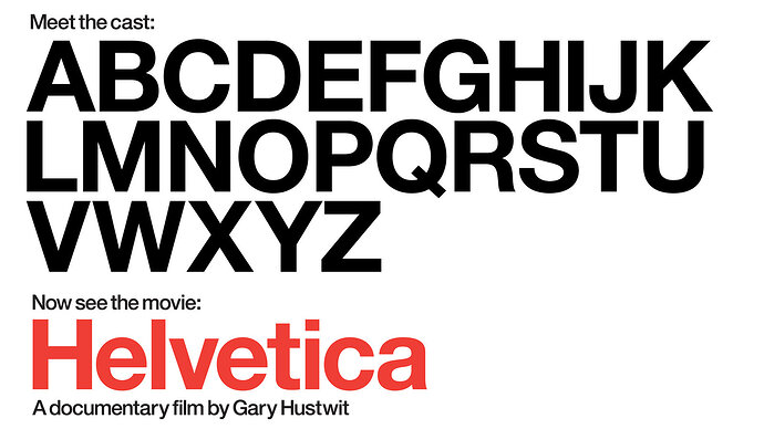
Also mentioned above, I also love Trebuchet MS and Arial MT Rounded. I’m on Linux now so I don’t get to use them often, but those will always be favorites. Helvetica is also the original classic.

4 Likes

The way Debian installs Microsoft’s Core Fonts for the Web (including Trebuchet MS) is pretty funny. The license only allows redistributing the EXE files as-is, so the script downloads them and uses cabextract to get the fonts out.

LOL, copyright shenanigans…

fonts1

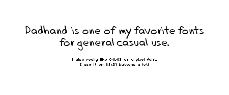
“Dadhand” is one of my favorite fonts for general casual use. I really like handwriting fonts in general; they’re just very comfortable in my opinion.

I also really like “04b03” as a pixel font; I use it on 88x31 buttons a lot!

1 Like

love to see a fellow fredoka one enjoyer!!! I was obsessed with this font at one point and was using it for eeeeverything lol. It’s so round and cute!

3 Likes

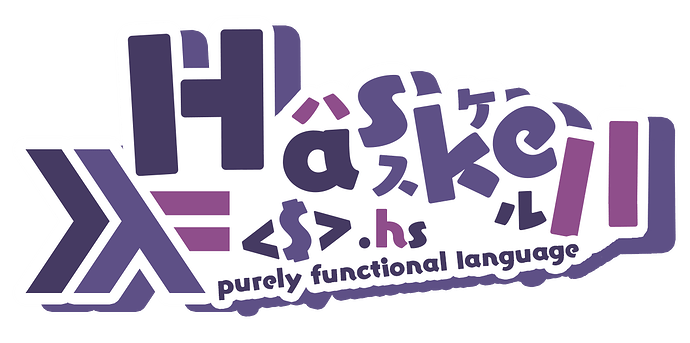
Not really into fonts myself (yet!), but a friend showed me this funny url:

https://www.haskell.org/?uwu=true

Which displays an alternative logo for this project:


Then they brought up wanting to make a similarly themed logo for their site and how they went on the hunt for the style’s font (Yuruka UB):

Courtesy of my homie: getimiskon. He called it a “VTuber-like / anime title-card” style. Enjoy!

2 Likes

I made a fork of Unifont called UnifontEX which actually has Plane 0 and Plane 1 in the same file (as much as possible, AKA it’s based on Unifont-JP 15.0.06 + 11.0.01 Upper, the highest you can merge without needing HarfBuzz’s new-fangled extensions to TTF/OTF), and it also has been improved under-the-hood to work in more use cases (like terminals and IDEs), and it is available in MANY font formats that were never offered by Unifont, and it was designed to utilize special format features not commonly used.

I personally like Unifont/UnifontEX’s emoji because they are the same resolution as the 1997 SoftBank emoji set as well as the 1988 Sharp PDA emoji set.

A problem with regular Unifont is that the emoji are separate from the regular glyphs, and that it doesn’t have the flags needed to show up as monospaced. UnifontEX however doesn’t have these problems, so it can be used to give an IDE or terminal emoji support.

UnifontEX was a ten-year project. Also it doesn’t redraw any glyphs.

Unifont/UnifontEX emoji are basically forum smilies. Also because UnifontEX has Plane0+Plane1 (and Unifont-JP’s Plane2+3 glyphs) in one file, it’s largely a better fallback font than Unifont.

I wish Emojipedia would add Unifont+UnifontEX emoji as well as Symbola emoji, because they DO have other Linux, pixel, and monochrome emoji sets.

Also, I use UnifontEX as my UI font on Ubuntu and Android, and as my web browser font on desktop Firefox+forks, and Samsung Internet + Stargon Browser on Android. I also use it in terminals, text editors, and even LibreOffice and Microsoft Word.

16x16px = 12pt on Windows so it’s technically usable for writing essays in MLA/etc (I do ask permission though).

Also I think that UnifontEX makes my devices have a sort of programmer aesthetic, especially with the wallpapers I use.

Also Unifont 15.0.05 and 15.0.06 (and thus by extension UnifontEX) use Galmuri Gothic’s Hangul, which were inspired by the Nintendo DS Hangul.

Fun fact: someone at JetBrains starred UnifontEX’s Github repository.

Also I’m not only a font person. I do other tech stuff too.

2 Likes

Arial Rounded MT Bold was my favourite font for a long time when I was younger, and I loved to use it when making graphics.

Nowadays, my favourite font is Lexend, which is designed for readability. I am using it as the default font of my website (and hosting the font myself), and I have set it as the interface font and occasionally text font in Obsidian (the note-taking software), as well as the system font of my Android phone.

I also like Atkinson Hyperlegible, which I discovered alongside Lexend through this zine named The Accessible Design Survival Guide (I would recommend checking the zine out too as a beginner’s guide to accessible design), and I am using it as my main text font in Obsidian. I appreciate that it was designed with low vision readers in mind, which is relevant to me since I have both astigmatism and near-sightedness

As for monospaced fonts, for a while my favourite was Hack, and I had been using it as the monospaced font in the text and code editors I use.

Now I have switched to Intel One Mono, as I love that it was designed with low vision developers in mind. I am hosting Intel One Mono on my website as the go-to monospaced font, too.

1 Like

I don’t know a ton about fonts, but thank you for bringing up Intel One Mono. I have very poor eyesight and this looks like a promising terminal/code editor font!

1 Like

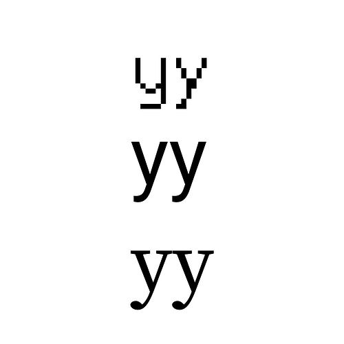
One thing I find perplexing about Unifont is their decision to draw the Latin y (U+0079) and the Cyrillic у (U+0443) differently. I don’t know any other font that does this.

It was done to mitigate homoglyph spoofing, though Unifont and by extension UnifontEX still aren’t perfect about it.

Unifont and by extension UnifontEX also do some rather interesting things with certain characters, namely they take the standard very literally but also have fun.

Favorite has to be Iowan Old Style

Been using it on my site for close to 6 years at this point and still loving it. Only thing I don’t like is that there’s no variable version available and i’m seriously considering getting into typefaces just to make it for myself.

so many new-to-me fonts!! so exciting…

i really like fun display fonts… Black Rider and Mad Homie are very handsome, and Lemon Tuesday has a nice casual handwritey-cursive feel without being too “live laugh love” ish i feel, which is a little rare for legible cursive fonts!