Just a little chit chat thread about favorite fonts! It can be specific fonts that are your favorite, or characteristics about fonts you like ^^
One of my favorites is Arial Rounded MT Bold which I am sad that they removed from ms paint. I like similar bolded fonts with basic letters that have thick rounded ends. Sniglet is a similar one that has even rounder letter shapes. Nunito is also a nice clean simple rounded font. Varela Round is another.
I of course like Nova Slim which I use for my homepage font for an elegant space vibe. Amaranth is a cool basic font that has some personality ^^ Overlock, Ruluko, Laila, Philosopher, and Arima are others. (Note that these are google fonts, I eventually would like to use and catalogue other fonts, but that is one of my many to-dos)
Anyways what are yours? What design decisions do you like in fonts? What trends do you dislike?
I think mine at the moment are Atkinson Hyperlegible and OpenDyslexic, just because they’re easy to read for me (my partner finds OpenDyslexic really hard to read funnily enough)! Atkinson Hyperlegible was one I came across when looking for easily readable fonts to use on my site and honestly it’s just grown on me now, I use it at pretty much every opportunity I get no matter what the project is.
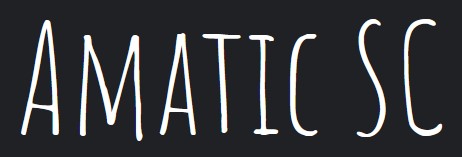
I also like Amatic SC for stuff like headings, since it looks more handwritten but without being too hard to read!
Oooh I also like atkinson hyperlegible! (that font sure can hyperlegible). I have to agree with your partner on open dyslexic though ^^; The unsual thickness on the bottom of each letter throws me off. The thin parts of the letters almost wash away.
I also like handwritten-esq fonts :3 I collected a few of them on my fonts page. Handlee is one of my favorites. Simple and neat, somewhat natural looking, not overly cutesy
i am a somewhat odd being in that im not a big fan of vector fonts, i prefer pixelated aesthetics, so my favorite fonts are
which i use in the terminal,
which is intended as a fallback font, but i actually like how it looks, and
the font ive been making
i also use atkinson hyperlegible as the accessibility mode font on my site, which i need to properly set up but im migrating to a new design so im dealing with that first.
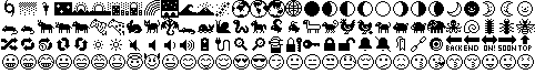
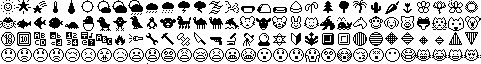
i love unifont! for those who don’t know, it’s used as a fallback font because it has full coverage of the basic multilingual plane and pretty good coverage of the supplementary multilingual plane. it was created in 1998 and it’s still getting updates!
my favorite part is the emojis! they’re super simple and (i think) really charming. here’s a small selection:
you can see them all if you zoom in on the lower rows of the plane 1 chart on the official unifont site.
i love pixel fonts. <3 this site is like paradise to me:
yeah the unifont emoji are cute as fuck. the emoji are one of the blocks i havent got to, largely bc im almost certain they wont be as good as the unifont ones
I’m not too versed in specific font names, but one I do know I really liked using when I make a google slide is
I used it for almost everything on google lmaooo, it was so a e s t h e t i c to me somehow??
A few ones I feel like gravitating towards are cursive/handwritten fonts that are actually legiable to most people. Which I know is an oxymoron, but I think there’s a ton out there. Also ones with decorations, but somehow balanced
i also enjoy legible handwritten or cursive fonts too! cursive and handwriting are two of the categories i have on my fonts page :3 i usually dont use crusive fonts on my website, but i did use a cute one on my recipies page (with a font changer button for those have a hard time reading cursive)
ive yet to explore non google fonts but id like to find fun little ones with decorations like you mentioned, enough to be fun, but not so much its hard to read.
this font was used in the logo for buffy the vampire slayer, which margo also designed the main “buffy” lettering for. fun facts :D
i also really like this font called Element, not a margo chase font but i just like how it looks because it’s smooth and easy to read and pleasing to my eyes.
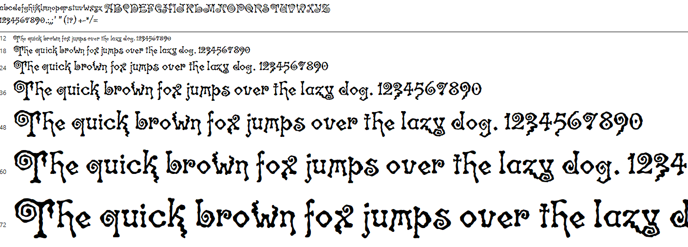
This is so gothic I love these so much! It’s personally not my thing I would use, but these are honestly so cool and the best part is that they keep the personality without making it illegible
That was a very cool read! I never thought too much about the consideration that goes into how wide each letter is. The process behind the duo and quattro font is very interesting.
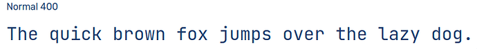
To me, a good font is like a window: it draws no attention to itself and allows you to see straight through it so you can focus on what really matters, i.e. the text. For this reason, I am a fan of Arial. It’s a simple, neutral font that fits this philosophy perfectly.
I also like Noto Sans. I usually use it in pixel art for dialogue and such since it fits my style well and looks good at low resolution. Inconsolata is a monospace font I also think is nice, but I prefer to use it as a display font rather than a body font.
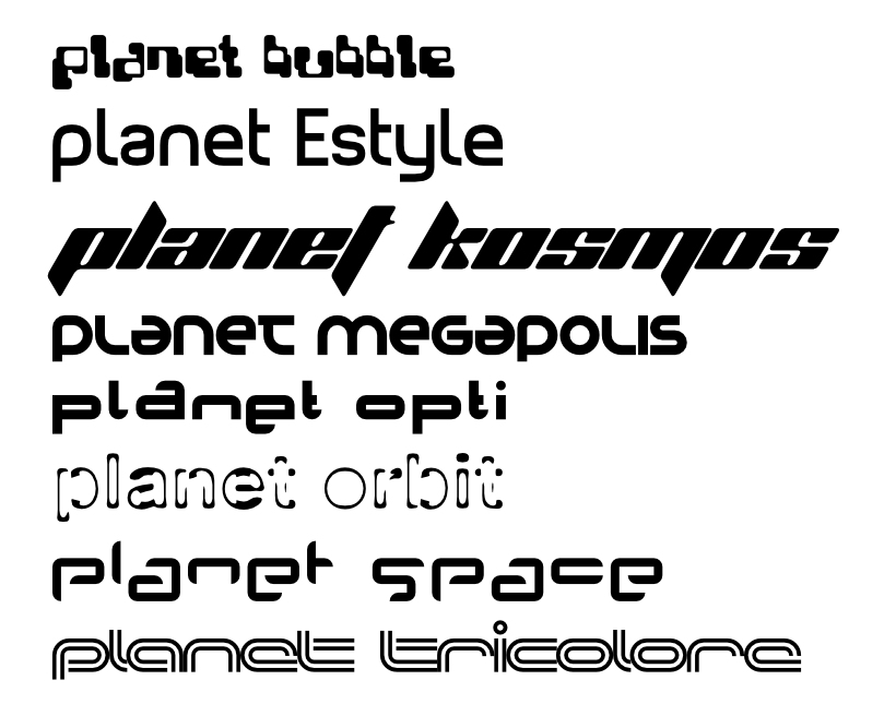
i really love the planet fonts! i use them all the time in graphic design projects, especially planet space - it’s the font used for the header image on my website.