Oh my god I love these fonts! Theyre exactly what I’ve been trying to find! y2k futurism is one of my fav aesthetics and would love to use these in a site one day!
Welcome Melvian!! I like the serif version of ABC Arizona, the line weight variation is nice.
(consolidating replies):
@frostsheridan those are some really cool and fun fonts! Each very different but all have something that links them together
I do like some simple fonts for that reason! I will definitely use a nice basic font for text heavy informative pages. There are some basic fonts out there that despite not being too bold have their own character once you start noticing differences in fonts.
![]() is one I like.
is one I like.
To build off of your window analogy though, sometimes windows are a part of the scene and are beautiful themselves! Fonts can be as intricate as a stained glass window, or as elegant and functional as a bay window ^^
I like Trebuchet MS — it’s very simple but the l, I, and 1 are differentiated clearly.
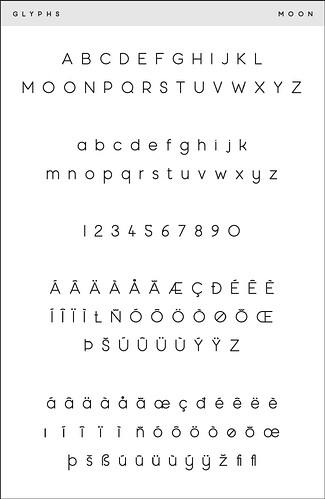
I wouldn’t say I know a ton about fonts but moon has served me well since I first downloaded it in 2015
Ooooh moon is a nice round font!! I’ll have to check it out ^^
@memo I also like when I and l are differentiated! It’s frustrating when I can’t tell which is which
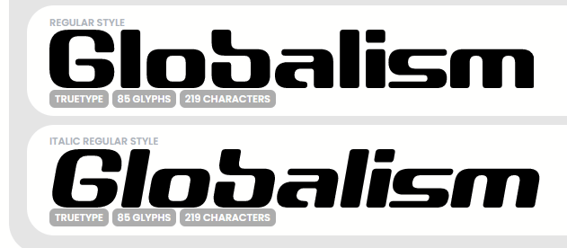
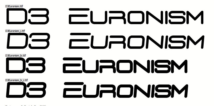
Some of my favorite fonts come from Digital Dream Design! In particular, their Circuitism, Globalism, and Euronism fonts…
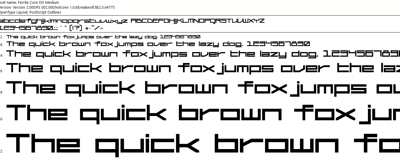
I’m also a fan of the Ferrite Core font!
Wow! I love the globalism font! Thanks for sharing :3
I really like arial rounded mt bold too!
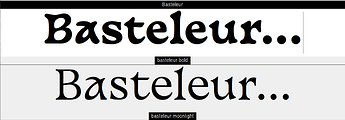
I have a couple of favourite fonts. Basteleur is probably one of them:
Velvetyne have some really handsome fonts, although they’re maybe used a bit too often because they’re available for free. They have some very ornate fonts that I’d love to find a way to use, some day…
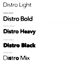
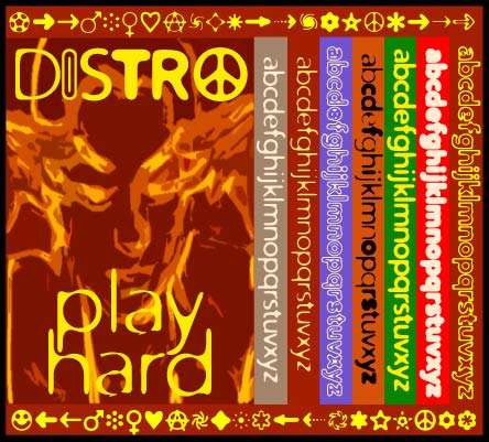
Another font I’ve been using a lot in the last few months is the Distro font family. A great variety of different weights & some great dingbats too. There’s a small website that uses this font but the name of it is escaping me…
Oooh I like both basteleur and distro (particularly distro bold)! thanks for sharing :3
Basteleur is a really handsome font! The letters have so much personality.
I was rummaging in my fonts folder & just found this promo image for distro!
Among my favourites is Karmina.
Since this is a web forum about web development-y things, I’ll just say I just go with system-default serifs for the most part. I have been known to use AmericanCaptain(American Captain Font | dafont.com) for things I want to direct attention to without using the Impact font
all of these are SO GOOD. i’m so glad we have so many font enthusiasts here :) i have a lot of favorites so i’ll work on compiling those to add later, but as far as default fonts go: verdana is my absolute favorite with georgia being a close second. helvetica is third. <3
I’m excited to see your compliation >:3
I also like georgia! particularly when its bolded And italicized!
Most of my favourites are paid fonts I bought during my brief stint as a web designer, so unfortunately, you can’t get them without paying, but I’ll share anyway!
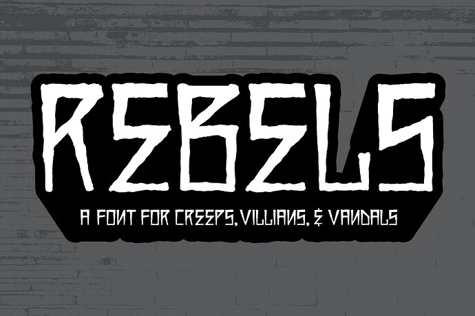
Rebels, which I believe I must have bought before it became THAT expensive.
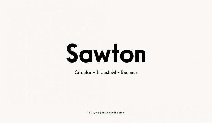
Sawton Bauhaus, which is actually a pay what you want font. I actually love all of Atipo Foundry’s fonts. I used Geomanist as the body font on my websites for a while, but I got more than one complaint about it being difficult to read so I ditched it.
Since I’m quite basic, I like Fira Sans and IBM Plex quite a lot. In fact, when I managed to use Fira X in LuaLaTeX, I decided to use only that for the rest of the year.
I’m also a fan of the Ferrite Core font!
Oooh! I use ferrite core a LOT (only once in my website though.) I also use it’s creator’s other font, Fantasma. And I’ve been thinking of buying more fonts, I’m just a fan of Froyo Tam
I’m sure some folks are aware, but for those who like fonts, check out the Safont webring from @xandra
https://xandra.cc/safonts/#about
