I’m currently working on a complete redesign of my website.
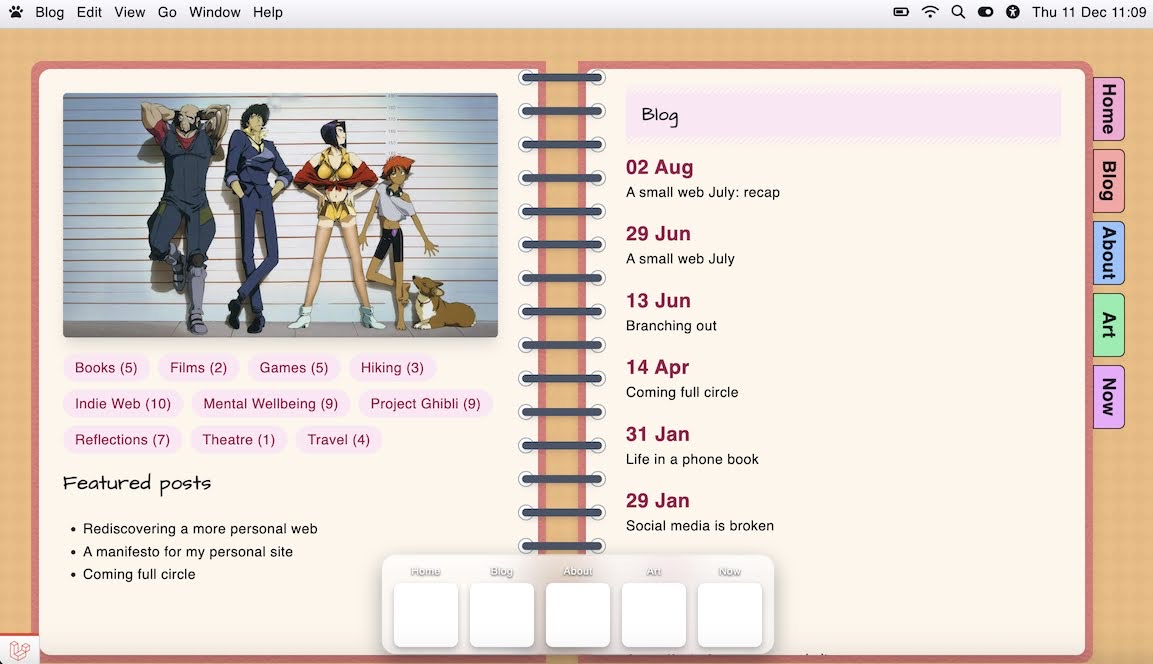
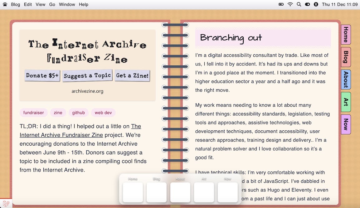
My current website is like a journal with different journal sections being tabs in the main navigation. I’m going for more of a macOS inspired desktop look, where every major section is its own ‘app’ (mobile view will probably be more iOS flavoured). However, I do like the skeuomorphic look of having apps based on their real world equivalents, and my existing blog journal layout is an example of this. I really like it and I want to keep it.
However, I’ve never been completely happy with it from an accessibility and usability point of view: the number of items I can have in the main navigation is limited and being on the right creates a weird focus order, and I don’t currently have a solution for mobile (I just don’t show half the notebook, completely breaking the blog navigation ). It also requires scrolling the right hand page to read articles. Although I could add a scrollbar, currently I don’t think it’s very intuitive that you need to do that and I think this could be pretty frustrating for my longer posts.
I’m thinking of either:
Making it a wider, single page view, possibly with the blog categories as tabs at the top, like a notebook that’s folded open
Replacing it with a Word Processor style app that scrolls and has the blog navigation where the navigation pane would usually be
Repurposing it for a different use such as double spread photo album
So my question to the community is: where do you feel you’ve had to compromise with your website? Whether in terms of design, functionality, content etc. How did you navigate this or accept it was a worthwhile compromise?
(If you have any suggestions regarding my notebook layout, these are very welcome too. Im really excited about the potential with this new approach to design lots of bespoke ‘apps’, I just don’t want to lose a layout I’ve fallen in love with )
So this is just an offhand thought I had, and I’m not sure it’ll be too helpful. But if you wanted to collapse the whole thing into one column, you could make it look like a flip-top notebook instead of a spiral bound one, at least on mobile. That way you’d get to keep the whole skeuomorphic idea, but since it’s slightly different you wouldn’t have everything split up into two side by side columns.
Thank you! So it’s actually funny that you mention that. I had the pleasure and opportunity to meet @capjamesg at an indie web meet-up a few months ago and they mentioned that too.
I had completely forgotten about it until now🤦♀️ I have to say I prefer the two-page layout, but for mobile, it absolutely makes sense. I will give that a go - thanks so much for the suggestion!
EDIT to add: when they mentioned it, I absolutely pictured pulling my phone out of my pocket and flipping it like a Star Trek communicator to view my website🤣
I am currently in the middle of making a book-style layout and I am thinking about adding a “distraction free mode” that opens a modal overlay for anyone who would prefer to read longer content centred on the screen. I haven’t implemented it yet so I can’t actually vouch for it being a good, workable idea, but it’s an idea that may help!
Nowadays most of my websites have a section made in Feather Wiki or Siteleteer. That’s very convenient, but since they require JavaScript (and generally a modern, mainstream browser) that limits the target audience. I try to mitigate that by never using them for the front page, but it still means that part of the site is “locked up” behind some hard requirements. It’s for a good cause, tho.
I haven’t made any compromises yet, mostly because I haven’t really worked on the visual design at all (hooray fatigue plus Eleventy woes~).
But I also have a great fondness for skeuomorphic design, and I’ve come up against similar issues with accessibility and responsive design when brainstorming ideas. I don’t want to compromise on accessibility, so my current plan is to use various skeuomorphic elements without making the entire layout a book or whatever. So I plan to do things like make photo galleries look like pieces in an art gallery (framed with info placards). For my fiber arts section, I plan to use a “stitched” font for my headings with fabric scrap backgrounds. Smaller details that don’t make it hard to read stuff or mess with the layout.
Me being the child of two professional IT workers—one of 'em specifically works with both networks (internal ones, but still) and the backend-side of webDev
Wanting to add a note to my site when I’m away from my computer
Literally everything on the Big Web being a live, always-on, server-side web app of some sort
Makes me feel like my site being a static site is a compromise, or that I’m not doing enough, or something.
But as someone who likes the design side of web dev and not really the programming side outside of some conditionals, filters, and for-loops… it feels like I’m chickening out our not reaching my full potential or something.
But man, I don’t know. I can only spend so many skill points on webDev. I gotta make illustrations and comics and graphic design and 3D models and— and—and—!!!
 ). It also requires scrolling the right hand page to read articles. Although I could add a scrollbar, currently I don’t think it’s very intuitive that you need to do that and I think this could be pretty frustrating for my longer posts.
 )
)