As someone who adores Atkinson Hyperlegible, I’m excited to try out these new fonts!
You can download them from the same page where you can get the original Atkinson Hyperlegible:
As someone who adores Atkinson Hyperlegible, I’m excited to try out these new fonts!
You can download them from the same page where you can get the original Atkinson Hyperlegible:
oooh, i’ve been waiting for a monospace version! ![]()
As some of you know on the Discord server, as a typeface designer I have some… thoughts about Atkinson Hyperlegible. Short version is that while its creators are well-intentioned and I applaud the original creators for learning type design (they’re not type designers), they really approached the design of the fonts the completely wrong way and creating a typeface for low-vision readers is precisely the kind of job that requires expert type design knowledge the most.
I’m glad to see that they made a new version. There are improvements, but it’s only a little better than the original. The monospaced version isn’t awful. Overall practically all of my massive criticisms about the typeface are still there.
Someday I’d like to write a thorough, detailed essay on why Atkinson Hyperlegible is not only subpar, but actually could have been more legible while appearing stylish and be well-built! I’m waiting to do that though, as I’m working on a typeface that aims to be a response to it. That way I’m not just complaining why a font is bad, I’ll also get to say “Here’s how I would have made it, and you can use this font too!” Which is a lot more useful for the vast majority of people.
Should you use Atkinson Hyperlegible? I don’t know, it’s up to you. As much as I don’t like it, there aren’t really any freely available alternatives (yet).
EDIT: Letters from Sweden had involvement in the new versions apparently, which is actually a type foundry. However, the people who originally created it were not type designers, and the new fonts don’t really improve upon their original design.
I’m not always on the Discord server, so I didn’t know that you were a typeface designer. Well, now I know!
Tangentially topic-related, can you share some of your thoughts on Lexend? I often see it featured alongside Atkinson Hyperlegible as another font supposedly designed for readability.
(Personally, I took one look at Atkinson Hyperlegible and fell in love with it. Nevertheless, I acknowledge there may be flaws with it that I’m not aware of.)
Lexend is generally better built than Atkinson Hyperlegible, but also doesn’t have as many of the good traits that Hyperlegible does.
My biggest issue with Lexend is that the study they used to test if it was better is questionable from a scientific standpoint. Specifically, since they were already doing scientific tests with it anyway, they didn’t isolate and compare each of the different traits of Lexend and run tests on those, they just made a design and then said “Well let’s see if it’s better than Times New Roman!” For instance, using the single-storey a probably makes Lexend a bit less legible than it could be.
That being said, Lexend’s multiple widths are a great idea. If you want to build an accessible typeface, at least do that! It doesn’t have multiple weights or italics though, severely limiting its use.
I’d also like to address dyslexic-friendly typefaces for a moment, since that often comes up in terms of accessible typefaces: There’s no evidence that they help dyslexic readers. In fact there are studies showing how it doesn’t help them, additionally the most widely accepted theory is that dyslexia is a phonological problem, in which case no type design would help with that anyway. You can read more about that here and here.
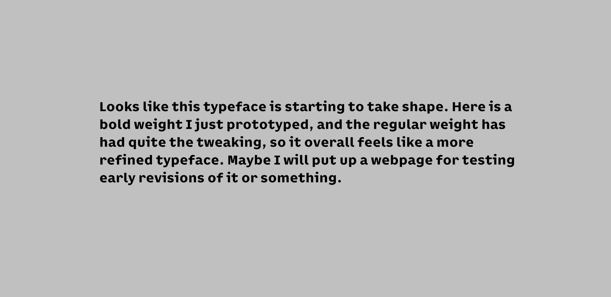
If you’re curious about what my proposed alternative would look like, here are some screenshots of an early prototype:
Thank you for sharing your thoughts, and that prototype typeface looks cute and lively!
i’m OBSESSED with your font, it’s so cute!! genuinely looking forward to early access for it! ![]()
tangentially related to this topic: i know there’s someone working on a fork of atkinson hyperlegible called lexica ultralegible as well, but another good monospace font that’s great for accessibility is intel one mono! it was specifically designed with the feedback of low-vision developers at every step of its development, according to its page. i use it in my browser settings and it makes reading source code a lot less tedious.
Thank you!
I heard about Lexica Ultralegible but didn’t really look into it until you sent me that site. It may not be as useful now with Atkinson Hyperlegible Next though, but before it came out it was supposed to be a slightly improved and expanded version. Honestly the accents are kind of yikes, I don’t understand what the deal with the rounded corners are. That’s another issue I have with Hyperlegible (including this fork): they’re focusing on making the letters legible but then make the accents as practically an afterthought. Rather than designing the accents to also be legible!
Intel One Mono I can comfortably recommend, as not only was it extensively tested by low-vision readers, it’s also made by a type designer who is definitely more experienced. Though personally I’m wanting something with a little more personality, so I don’t use it myself.