I think having the categories view as the default is fine, especially since I can easily access the topics page still if I want to. Having the default set to categories also makes more sense for a forum anyways IMO.
3 Likes
A bad habit of mine is checking websites with the WAVE extension. It’s not happy about the lack of some alt attributes, and really not happy with the lack of contrast of the theme that’s the default (Summer iirc).
Maybe something to adjust, or perhaps see if people who struggle with low contrast can be quickly guided to an alternative theme? ![]()
4 Likes
This is a good point. There are multiple color schemes available, you can select one to be used in Preferences → Interface. I noticed there were a few areas where Summer had color combinations that are very hard to read (notably on the user profile), but oddly the offending text color isn’t anywhere in the color palette. I do think it is very important that we have a solid default color scheme, so feedback on those is much appreciated.
2 Likes
i was wondering if in the “Media” category there could be a books/poetry/writing tag? this would replace #reading-library; since tags are required to post in that category i think it limits a lil bit without having that tag mhm mhm
3 Likes
great idea! added those :)
1 Like
im not sure if this is a result of my inexperience in forums, but the reply nesting is a bit visually cluttered to me, where a reply to someone’s reply to a topic appears as a nested reply that you can toggle to reveal, but also as its own reply at the bottom of the topic replies. not sure if this will be confusing for others as well or just redundant/cluttering for topics that might get a lot of replies and conversation going once the discourse is open to public
3 Likes
That’s an interesting one and I didn’t notice the nested replies until you pointed it out.
That said I was wondering why I didn’t get a “quote” of the post I was replying to in my reply post like I would on a traditional forum…
3 Likes
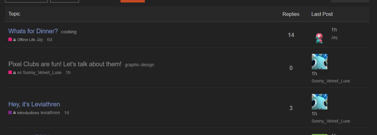
i’ve noticed a couple formatting errors in relation to the topic lists on the forum.
-
whenever someone with a long username is the last replier of a post, it elongates the ‘last posted’ column, making the topic height bigger than it should be. you should probably elide long usernames if possible
(the first thread is normal height. the second and third are taller than they should be due to the longer username clipping past its intended width) -
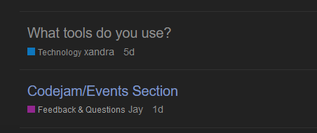
i feel the gap between the category title and the thread poster’s username should be just a bit wider. maybe put a small bullet point between the two, for added clarity?
(an example of this effect in action. if i wasn’t any wiser, i would have assummed that the category the Codejam thread was posted in was called ‘Feedback & Questions Jay’. :V)
other than that, don’t have much to say at the moment. (i do have some issues with how kinda cluttered the UI is but that’s a Discourse Company problem, not a you problem ![]() ) keep up the good work!
) keep up the good work!
3 Likes
i haven’t used either of these, but i’m wondering if it’s redundant to have both messages and DMs between users? while i understand that they’re different formats, opening someone’s user card and being prompted with either the option to “message” or to “chat” is a little bit unclear.
on a related note, the discord allowed people to choose a role to indicate whether they’re open or closed to DMs. is there a way to achieve something similar here? maybe added to our profiles like pronouns are?
4 Likes
One thing thats been bothering me as I use this, is the fact that when I reply to someone, it doesn’t show who I replied to when I post my message. I normally would expect something next to my username to say who I’m replying to. Not awful in casual threads, but I feel it may make things confusing in more complicated topics, especially help topics.
3 Likes
This needs to be the default right?
edit i replied with a quote, and immediately it automatically removed the quote so it looked like the “standard” reply. wild
2 Likes
on a related note, the discord allowed people to choose a role to indicate whether they’re open or closed to DMs. is there a way to achieve something similar here? maybe added to our profiles like pronouns are?
Yeah I’ll set this up; I don’t have any immediate thoughts on anything else mentioned in here for now bc I’m tired as hell but I can do this quickly, as a profile field similar to the pronouns. Good catch!
4 Likes
this is a super minor issue, but i noticed the header logo looks a lil crunchy on desktop compared to on mobile for me. here’s how it looks in vivaldi and firefox on desktop:

![]()
vivaldi is the crunchier one for sure ![]()
vs how it looks on mobile firefox for me (disregard the jpeg artifacts, it looks much smoother outside of the screenshot lmao)
1 Like
I think it shows who you’re replying to only if they’re not the post immediately above yours. See Jay’s reply in this topic for example.
EDIT: For some reason my reply show’s up differently than Jay’s. I’m not sure why it’s inconsistent like this.
1 Like
Good catch! It doesn’t look crunchy on my screen but it’s probably a difference in screen resolution.
2 Likes
Hmm I wonder why this is. I made the header equal to the specifications given ![]()
Maybe it is a resolution thing…? But it’s not like I made it huge then scaled it down. Idk I’ll troubleshoot when I’m home, setting a reminder now.
1 Like
oooh I see it now that you point it out, thanks! I have a feeling that it didn’t show the icon for you because you quoted me in your reply, so that serves an an indication of who you’re replying to ![]()
1 Like
i think it came up in chat earlier, but i can’t seem to find it now: channel descriptions. the only place i can see them is hovering over the channel in the sidebar. am i missing a description anywhere else?
2 Likes
for the chatrooms, you can also view descriptions by clicking the “Chat Channels” item in the sidebar. it’ll take you to an overview of all the chat channels
1 Like
On mobile view it’s a little difficult finding the chat descriptions too. I have to click on the chat options and then go back to settings to see the descriptions
2 Likes