Hi friends, I’ve been away for some time as I was busy with life and with a new updated theme for my website, you can check it out here
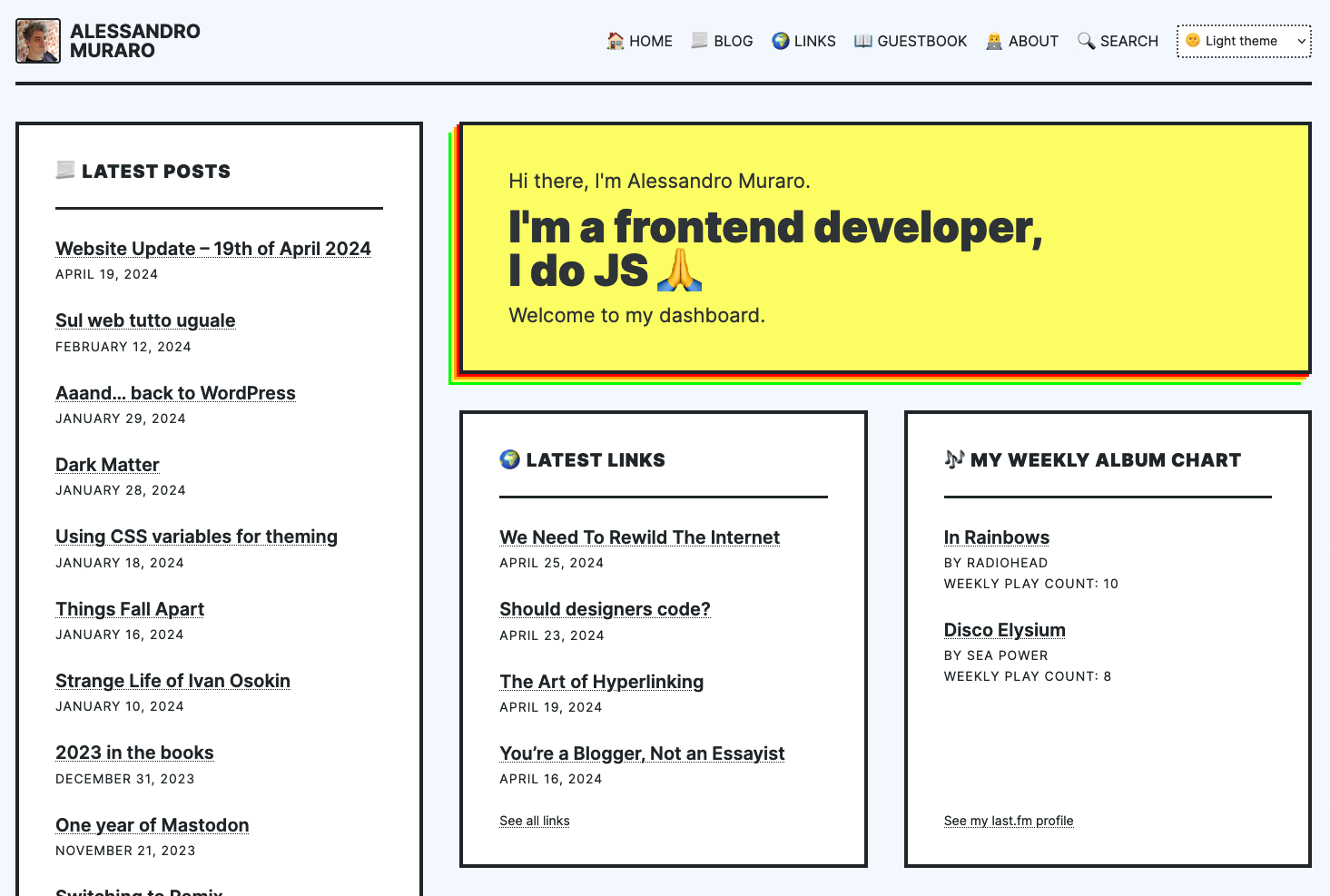
I was inspired by Cyberpunk 2077 (that’s why the yellow) and I wanted to create a “brutalist” site that would be a dashboard for everything about myself.
I still have a few ideas to be implmented (like some sort of chart perhaps)
What do you think? ideas? All feedback is welcome!
Hey there! Love the site, very clean. I don’t feel like I should be giving feedback to someone who’s been web building since the 90’s but maybe an idea or 2:
Are you familiar with About Ideas Now? You already have an /about page, but you kinda have your homepage acting as a /now page (this is a separate but related project by Derek Sivers). You’d just be missing an /ideas page. This wouldn’t entail changing your landing page, but it might make the /now page feel a bit redundant possibly.
I like your links page, but lately I’ve been advocating for the idea of contextual hyperlinking as @fLaMEd discusses in this post: The Art of Hyperlinking. So, like, maybe say a short sentence about your friends, what do you like about them, what do they post about, etc. Same on the links page.
I’ve been browsing your website the past couple days and really love the homepage. I’m in the middle of redesigning mine to look similar after looking at Frill’s latest iteration. Yours just sealed the deal that it is a great idea.
I think your positioning of your Links box vs your Blog Posts box is unintuitive to me. I see the logic: the right-most column is longer, so that’s where your posts go because there are more of them and they’re more important. However, my intuition for websites is that blogroll goes in the sidebar and content goes in the center of the page - I clicked through on your links and were surprised that they were links, went back to check the main page and only then noticed your blog post column. My eye is drawn to the colourful ‘I’m a frontend developer’ box and then travels down, not sideways.
The overall ‘look’ of your site says web professional (not hobbyist), so that’s good!
I enjoy the Darker and Solar themes best, & the shrinking/expanding of the columns and font sizes is really elegant and pleasing to see (as someone who spends a lot of time stressing over my website’s behaviour)
Yes, I think this is good: the eye is drawn first to the big yellow box, with your important information, and then (if you’re from a left-to-right reading culture) to the Latest Posts