Please troubleshoot / roast my online web store - been tinkering with this for years - need feedback to get it to the next level. TIA
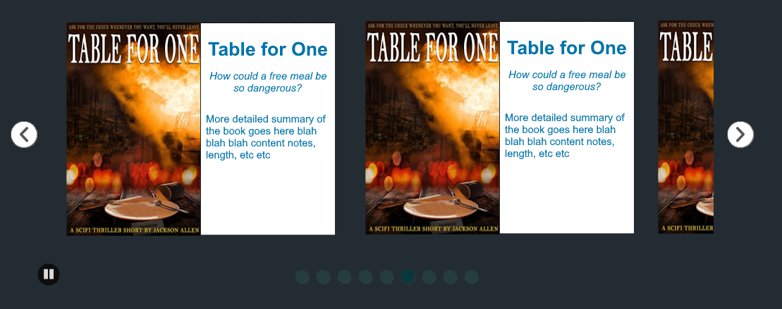
the colors are kind of ugly in my opinion, and there’s a lot of big visual elements and negative space that i find kind of distracting and disorienting for something that’s trying to sell me writing! the auto-moving carousel is especially irritating since it keeps drawing my eye away from the text while i’m reading.
the repetitive copy at the start of the page makes it feel like bot-generated seo and not especially human;
Emergency Reality Shelter – Science Fiction Short Stories
Emergency Reality Shelter – Science Fiction Short Stories – Fast, sharp sci-fi short stories about the end of the world, the future, and the choices that still matter.
which i think is especially bad since it’s right at the beginning! you definitely don’t want that to be the first thing someone sees, since it’s likely to make people dismiss the whole page as junk and exit without looking further.
i also think the order of things on the page is kind of messy/confusing, and the line height is too big in some places!
based on the page source and the footer, it seems like it’s built with wordpress, which i don’t know a single thing about, so i dunno which things you can change or how easy it is, but here’s a mockup with my suggestions.
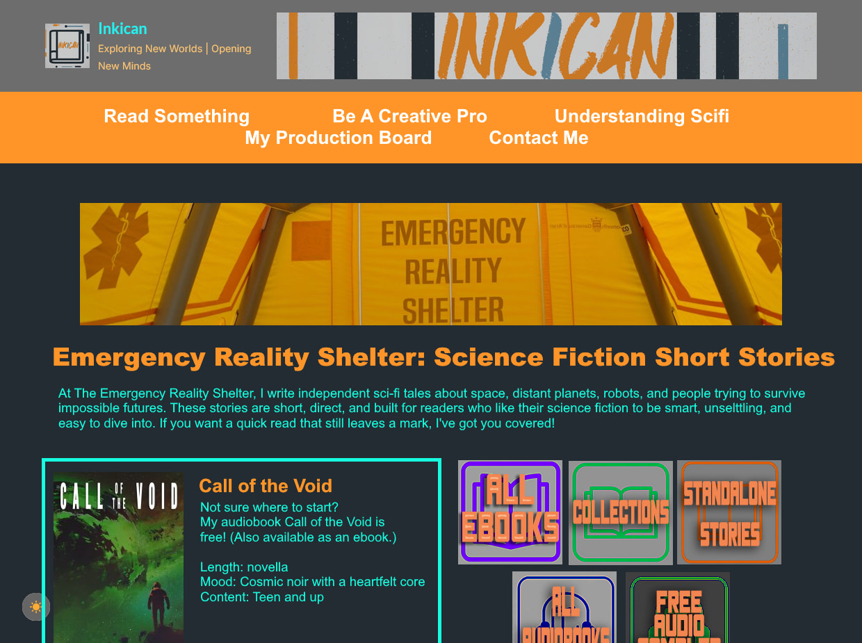
- color modifications; dark background is #222C32, orange is #FF9429, bright blue is #16FDE0. i’m not a fan of grey with color on top, it’s hard for me to read and looks kind of awkward! the background color is pulled from your logo up top for color harmony. if there’s going to be lots of colors, i think multiple shades of gray as well just make everything feel kind of visually muddy; if you’re attached to the gray i’d recommend a more toned-down monochrome look with all white-black-grey text and only some color for visual pop.
- opening copy; i moved the paragraph that was under the carousel up top, so the page opens with the more informational stuff.
- free thing first; putting call of the void up top and prominent is i think a good way to give people a starting point - it’s free, so they can get a sense for your style, and it’s just one thing, so it doesn’t feel like they’re overwhelmed with options immediately.
- book navigation first: i generally prefer navigation features to be higher up on a page for ease of browsing. just a personal preference!
for the carousel, i think shrinking the book covers somewhat and adding more text about the books would be good; as-is, the presentation is unbalanced in favor of the image, which doesn’t really make sense for a prose book (would be more understandable for a graphic novel or picture book, where visuals are a big component, but since these are prose i think better balance with text is more appropriate)
something more like this -
currently your page has this general structure;
- blurb
- books
- general information
- book
- book
- navigation
- navigation
- general information
i think it would be tidier to group things together a bit more, and separate out some of it to a separate page.
it’s not super clear why some things are in the carousel and two of the stories aren’t; i think having call of the void separate/highlighted because it’s free makes sense, but i’m not clear on what the deal is with the rocket. it just seems kinda messy; if it’s also free, or a good entry point to your work, or something like that, please clarify that and emphasize it! if it isn’t, just stick it in the carousel with everything else.
i think browse by format + browse by vibe should be moved up towards the top of the page so navigation is early - preferably before the carousel - and “how buying works” should be on its own page included in the top nav bar. the information in “quick questions” should be either in your opening paragraph or on an “about” page along with the “how buying works” information.
your book covers are quite nice! i feel like self-published books often have not so good covers, or they somehow don’t really look like book covers in a way that’s hard to pinpoint, but yours look good! very book-cover-ish, haha.
the second carousel at the very bottom of the page is very mysterious to me! it’s not labeled at all; it looks like blog posts, but there’s no link to a blog section anywhere on the page? are these pieces available/collected somewhere or are they only accessible via the footer carousel? it’s a bit of a weird element that’s hard to understand, and without a label or any information its inclusion seems like a mistake!
it also seems like you have a bunch of subpages and no centralized navigation for the site in general, which makes navigation a bit chaotic; i would recommend either a sitemap and/or improving the nav bar so it includes more of the site. as-is it isn’t clear which things are related to “emergency reality shelter”, the scifi project(/store?) and which are part of the site overall.
for the navbar i would recommend dropdowns with submenus, organized something like this;
- About
- My Sci-Fi Writing
- Blog
- Understanding Scifi
- Writing Help
- Free tools for authors
- Creative survival guide
- Contact
- Join my discord
- Sitemap
that’s my thoughts! i thiiink that’s everything that stood out to me. hope that all makes sense. feel free to take or ignore whichever you feel like. i don’t sell things and don’t know anything about SEO as well as being wholly unfamiliar with wordpress, so this is just from a user perspective.
5 Likes
Greatly appreciated - thank you!
1 Like
I think you should change the font.
Also, change the layout latest for “blog” and “browse the biggest stories”. I think they shouldn’t be side by side; instead, they should be below each other, if u get what I mean.
1 Like
Thanks for the feedback, everyone. I’ve re-rolled the website / online store into a new format. I need to make other changes, but would like to know if you think I’m on the right track:
1 Like