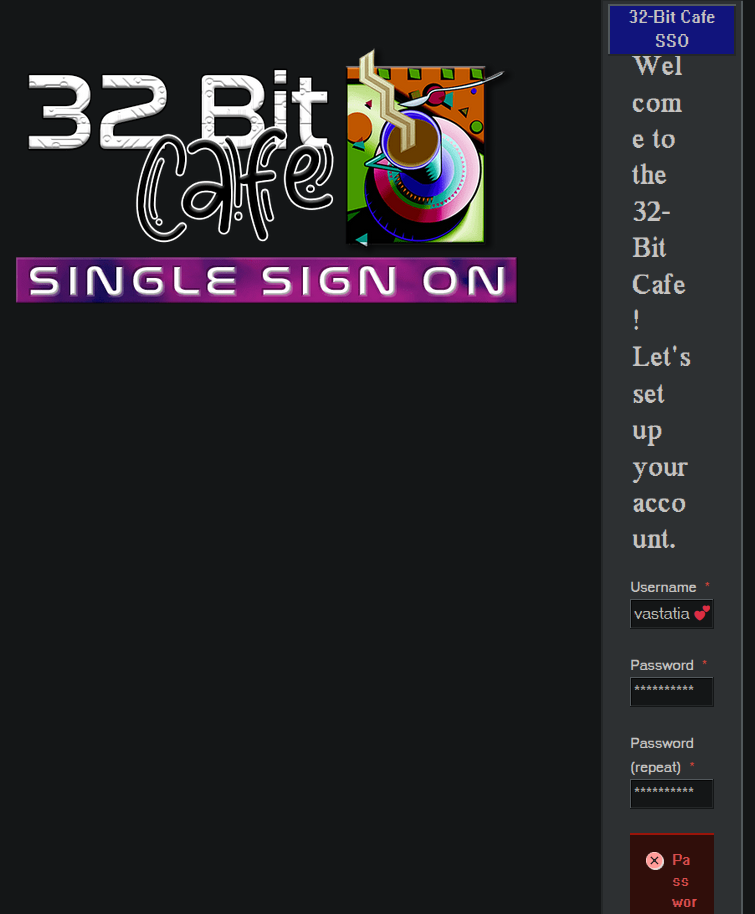
I’m not sure if this is the right place for this, but the signup form for this site is a very narrow column in Firefox for Ubuntu.