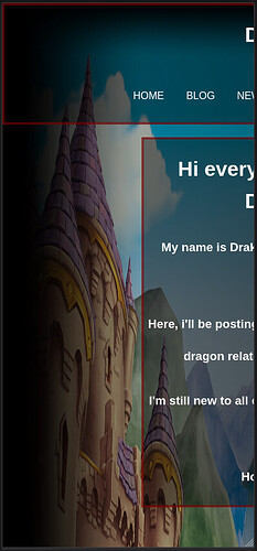
hey guys, sorry for not being all that active recently. i’m trying to see what can i do to improve my website but i don’t know what to do. Can you all give me yoour opinions on what i should do to improve on my website and how to do so?, I’d be very thankful
Because you’re using position: absolute; and percentages for top and left on the .box class, that div is overlapping your header and nav bar. You might want to look into using margin instead.
For example, getting rid of position, top, and left and adding margin: 20px auto; to .box will put 20px of space above and below the .box div, and automatically center it.
hi, thanks for the advice!. thought i’m now having a issue where i if i go to my website, i can’t visualize the changes on the main page but i can on the shrine. But then neocities does show them to me. Does it has something to do with my monitor resolution or is there something else going on?
Yes, it’s probably your screen resolution. 20% on a 1280x720 screen isn’t the same as 20% on a 1920x1080 screen.
that’s good to know, but i don’t quite understand why it’s so inconsistent since the changes don’t appear on the main pages but they do on the shrine pages. if that’s the case, then it should be consistent and the entire website should look the same
Are you using the exact same styles on your main page and your shrines?
yes, i even copy pasted the style css to the shrine css. the only difference they have is the background image
remember to do a hard refresh after you make changes! (that’s control+shift+r on windows, command+shift+r on mac) you might just be not seeing the changes because your browser is loading a cached version rather than the newest one, hard-refreshing will fix that. (it’s a common problem i’ve found!) - the main page and the shrine look like they’ve got the same margins to me!
i think it looks pretty much fine at the moment! i could think of some things to jazz it up a bit visually, but what type of improvements are on your mind? (ie: do you want to change the visuals, add new pages, implement some kind of fancy features…?)
or, is there anything in particular you aren’t happy with or that you’d want to add?
personally i think a fun decorative fantasy font for your website title “Dragon Palace” and more pictures of dragons would be fun! like a dragon favicon and a dragon mouse cursor. and i’m a big fan of changing the scrollbar colors on everything, i think it’s a very nice little touch that helps tie things together visually! i like having lots of distracting visual decor, though, which isn’t to everyone’s taste :P
Hi, thank you very much for the tip about hard reload. i never knew that was a thing. it’s going to be very useful when updating the site.
as for what i have in mind for improvements. i don’t have anything in particular, just general stuff like the visuals, optimazation and features. Anything you think it’s whorth pointing out.
those are some pretty good ideas, i defenitely like the custom font and mouse cursor but i don’t know how to do any of those. thought i do want to avoid visual cluster as much as possible
Because you are using width: ; rather than max-width: ; your page looks like this on mobile views
There’s a good overview here: Min and Max Width/Height in CSS
i corrected it as you recommended. hopefully it will look better now. Thank you very much
a cursor is easy-peasy! it’s just cursor: haha.
you can copy/paste the code from a cursor site - totallyfreecursors has a bunch of some dragons and instructions on every cursor page with a copy/paste code snippet prewritten for you!
or you can do it like this with your own images;
html, body {cursor: url('url of cursor image goes here'), auto;}
i believe custom cursors require a fallback in case it doesn’t work - so, you can’t just put cursor:url();, you have to have it as cursor:url(), [fallback cursor];. “auto” means the browser will just use the normal cursor if the custom cursor doesn’t work!
you can set the cursor for any element you want, in fact. there’s a lot of underutilized criminal potential in cursors i think. here’s the mdn page for cursor !!
custom fonts have an extra step, but it’s not too bad. like cursors, you can do it yourself with your own file or use something like google fonts and just copy-paste their code!
to do it yourself, you stick this at the beginning of your CSS
@font-face {
    font-family: 'My Cool Font';
    src: url("url of font file");
    }
so your stylesheet knows that by ‘My Cool Font’ you mean “the font in this font file”
and then you can say
div {font-family: 'My Cool Font';}
and it’ll be your cool font that you uploaded!
dafont, 1001 free fonts, and fontspace are cool places to find fonts.
