I’ve been using computers since the early 90’s so I’ve grown up going through all manner screen technology, from CRT, to Plasma, to LED, to LCD, and so on. And one thing that significantly changed that not enough people talk about, is how unreasonably bright LED/LCD monitors are.
I don’t have the exact numbers on hand, though, through this discussion on Reddit, you can see some of the NIT numbers of LCD vs CRT, as well as the contrast of the rich colors on the CRT monitor to the washed out ones on the LCD. And this old Display Mates chart mentions issue with matters of Black Level, White Saturation, and Gamma. And I’m sure anyone here that messes with both new and old tech has seen the same thing. Current displays are, without a doubt, bright.
Back in the 90’s and Early 2000’s I pretty much never saw the extreme hatred for ‘Light Mode’ as I do, now. People certainly had their preferences but people weren’t met with insults and hissing just for mentioning/showing a lighter-based pallet. Even myself, I could easily write on white paper with black words for hours without much issue, and now I prefer a mid-tone background. And I don’t think it has anything to do with my eyes or age, but rather, the intensity of lumens produced by screens these days. I know this because my sensitivity to white backgrounds on screens jumped significantly when I was finally forced to switch from a CRT to flat panel monitor.
I had a CRT that I desperately hung onto until about 8 years ago, because it was a Samsung flat-tube CRT that was energy efficient and just all around decent. The colors matched anything I printed and the balance was all around good. But having a 4:3 monitor in this day and age, in addition to the shrinking living space I was dealing with meant I had to replace it, eventually.
When I first got my current ViewSonic monitor, I experienced significant eye-strain and pain in my shoulders and neck almost immediately. I spent hours tuning my monitor to match the output of brightness and color that my CRT had, and my headaches and muscle tension caused by eyestrain, vanished.
This is the setup of my current monitor. As you can see, I’ve had to reduce both the hardware brightness of the monitor AND the gamma/brightness on the software level.
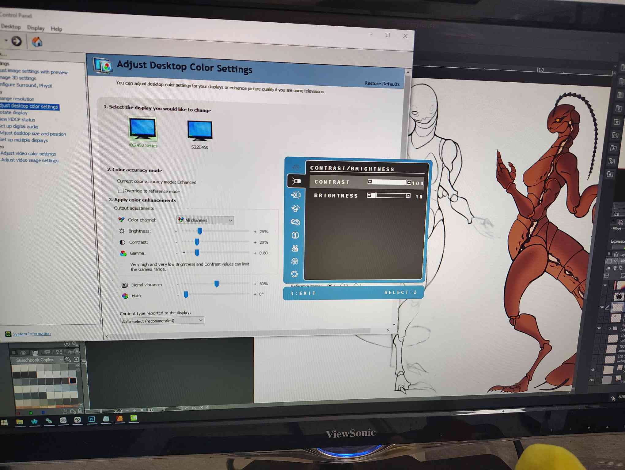
Despite it being turned down so low, it doesn’t look dim, at all.
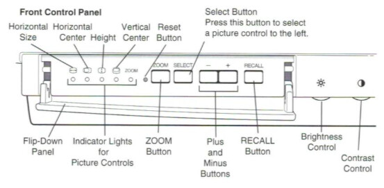
Most of you probably have screens that are far too bright and don’t even realize it because that’s what you’re used to, and possibly all you’ve ever known. And worst of all, you might not even be able to change it. Phones and other mobile devices only let you change brightness and never let you touch Gamma. Monitors hardly ever let you touch the Gamma unless it’s one of the high-end models.
There are a lot of things that could be solved by decreasing the brightness of your devices (where possible). The obvious being eye-strain induced headaches (and other neck and shoulder strain caused by that eyestrain). Others being ‘blinded’ by light-modes and weird light balance in games. Another is the pesky visual artist issue of your art looking dramatically different on other screens: Your art monitor is probably too bright. (the other is color profiles but that’s an entirely different issue) I’ve been using this cheap monitor that I manually calibrated and the stuff I make doesn’t look too dramatically different on other devices, or when I print it, and I believe that is largely in service to the fact that I work on such low brightness.
So yea, it may be a good idea to mess with the gamma/brightness on your monitors, yank that down and see where you can get it to the best equilibrium for your eyesight needs. It may not only just improve your browsing experience and your visual creative works, but also, your health.