What’s going on, Internet? What did you do to your website today?
I modified the full post listing (for desktop and mobile). The category and title together were italicized, and I changed both separately. I think it looks a lot sharper, but I’d love some feedback.
7 Likes
That new font looks great! Very readable.
As for me, just some small tweaks today:
First, I realized my categories weren’t set up to automatically slugify. Fixed that in my Jekyll _config.yml file by changing my permalink structure to the following: /blog/:slugified_categories/:title/ This temporarily broke all my existing links I’ve shared to my blog posts, but I don’t have many blog posts up at the moment, so that was easily remedied between here and Mastodon. ![]()
Then I added in floating footnotes (on desktop only) for people like me who are lazy and don’t like jumping back and forth between the main content and the bottom of the page to read footnotes. You can see the floating footnotes in action on any of my blog posts, like this one. Just hover your mouse over the footnote superscript! I might write a little tutorial on how to set this up, as I had to figure it out myself. The few tutorials I could find for floating footnotes on mouse hover required JavaScript, and I didn’t want to use JS.
Finally, fixed a longstanding footnote-related annoyance. On the mobile version of my site, my phone automatically converted the standard footnote return icon into the “![]() ” emoji, which was very irritating. Resolved the issue by adding
” emoji, which was very irritating. Resolved the issue by adding font-family: monospace to the .reversefootnote CSS class.
2 Likes
While not exactly today, I have finally revamped and decided on a style going forward with my website. I decided to go completely simplistic.
I still want to learn more HTML codes and figuring out better ways to edit the layout while not breaking the containers since that seems to be the biggest issue thus far. Lists not staying in containment being a main issue for me.
5 Likes
I’ve been sitting on several craft tutorials that I wanted to post to my site, and I’ve finally taken pictures for them and made them live! New ones are how to make a 1/6 scale pizza, a microwavable eye mask, and an NFC tag for sharing your website with people in the real world:
4 Likes
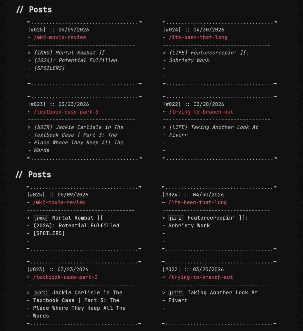
I’m working on a new overall style for the website to celebrate its first anniversary, which will be at the end of this month. It’s very close to the current style, just a bit more… refined. It’s pretty much Mark II.
It’s currently not live because it’s currently not ready. But here’s a sneak peek at the current WIP.
3 Likes
These are great. I especially love the microwavable eye mask tutorial!
1 Like
A couple days ago I rainbow-ized the front page of my website for pride! this will stay up throughout June.
6 Likes
11.06.2026
- switched microblog feed to the new system (was due since 2024)
- slightly updated colophon page
- fixed some broken assets
1 Like
changedd home page musicc
Cyberspace. dw before people enter there is a warning for autoplaying music
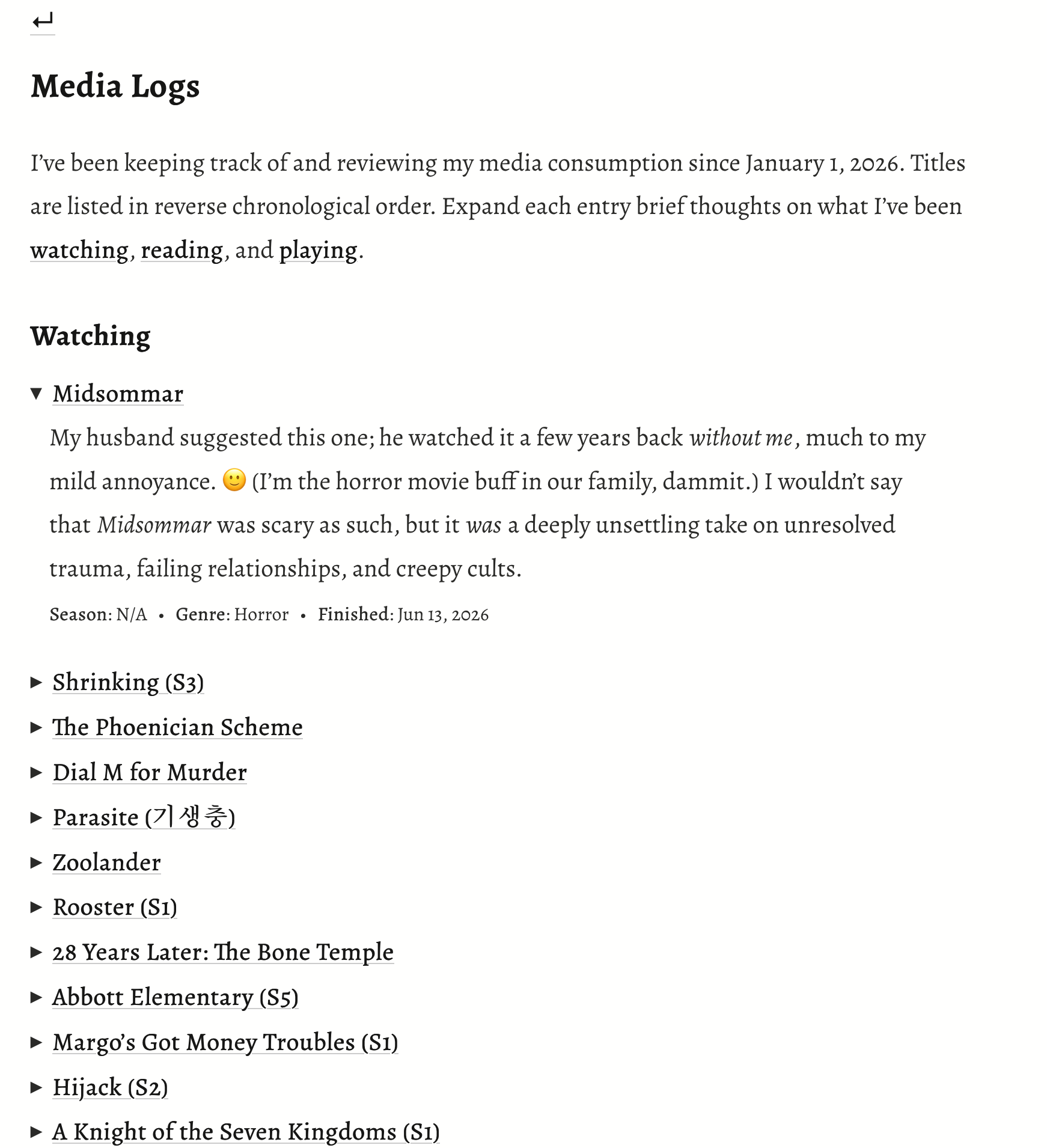
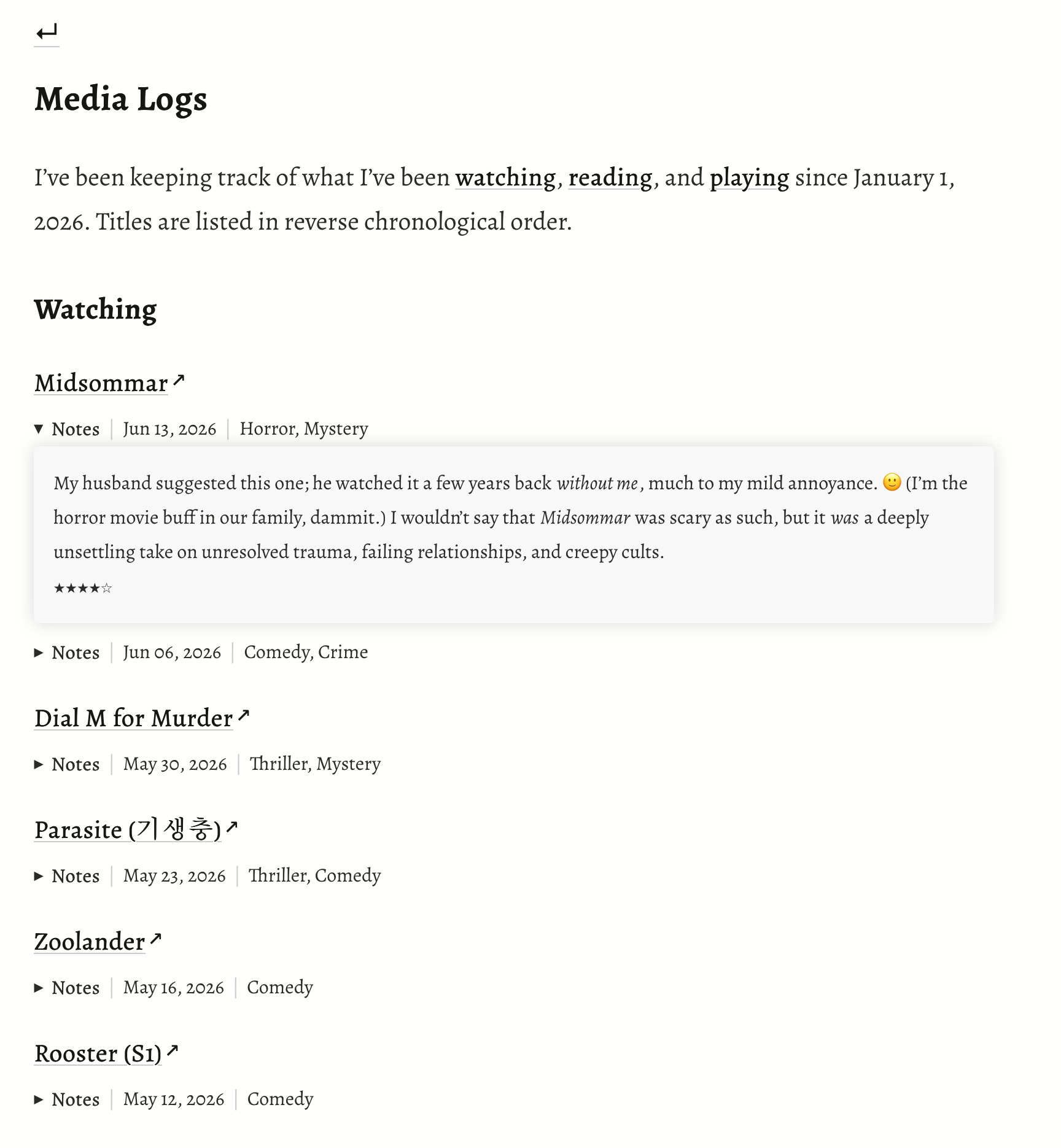
Made some small modifications to my logs page that will hopefully make it more intuitive to look at and navigate. I previously hid everything about each title (including my commentary) with <details> and <summary>, but worried that visitors might miss this information by accidentally clicking on the external link instead of the details arrow. Now, <details> and <summary> are only used to hide my commentary (“Notes”).
Before:
After:
3 Likes
Finally got my Media Log page done today. The rest of the sections are still a work in progress, but at least it’s coming together little by little.
1 Like
Credits. changed my credits, gave more info about each credit and made it look way better
I like the background! Just an FYI, though, in case things look different with your own browser/resolution settings: your text spills out of the white div and becomes very hard to read. This is what it looks like on my end.
If you want to fix this, just remove the height: 700px; line from your .whatever div class. You may also want to consider adding padding: 1rem; to that class, so that the text isn’t mashed up right to the edges of the div – a little padding makes it a little easier to read.
1 Like
thank uuu! I will fix it rn!! I can’t see that on my browser ![]() .
.
You’re welcome!
I figured that was probably the case; whenever something looks unexpected, it’s usually because the site wasn’t tested on different resolutions or browsers. Whenever I add a new feature or make a big layout change, I try to test for as many different end user scenarios as I can! I catch a lot of unintentional errors that way. I’m lucky enough to have access to a few different operating systems (MacOS, iOS, Windows 11, Linux/Kubuntu) and browsers. Most browsers also let you test out different resolutions as well. If you use Firefox, for instance, when you right click and hit “Inspect,” you’ll see a toggle for “Responsive Design Mode” (icon looks like a smartphone on top of a tablet). That allows you to select different screen resolutions and devices to get an idea of what your site looks like to different users.
1 Like
thank you! I will try to do that now
I love how you organize your website!! very inspiring
1 Like