How to Flex(box)
So, here I am, attempting to write a somewhat digestible guide on how Flexbox works. There are a few great resources out there for example “An Interactive Guide to Flexbox” and “What the Flexbox” but I understand that sometimes those guides are way too much, especially for beginners.
And so I’m gonna try to write a somewhat digestible, short guide on how Flexbox works. So let’s get started.
First thing first, contrary to the classic display block and inline-block and inline, flex, like grid, works as a combination of parent and child elements. Using flex on a container with no children is—almost always—kinda useless. There are some situations where it makes sense but there’s no point in discussing them here since the goal is to make it simple.
So, for all the following examples, I’m gonna use the following markup:
<div class="flex-container">
	<div class="flex-item">1</div>
	<div class="flex-item">2</div>
	<div class="flex-item">3</div>
</div>
A simple container, with three items inside it. Should be enough to understand the basics of how flex works.
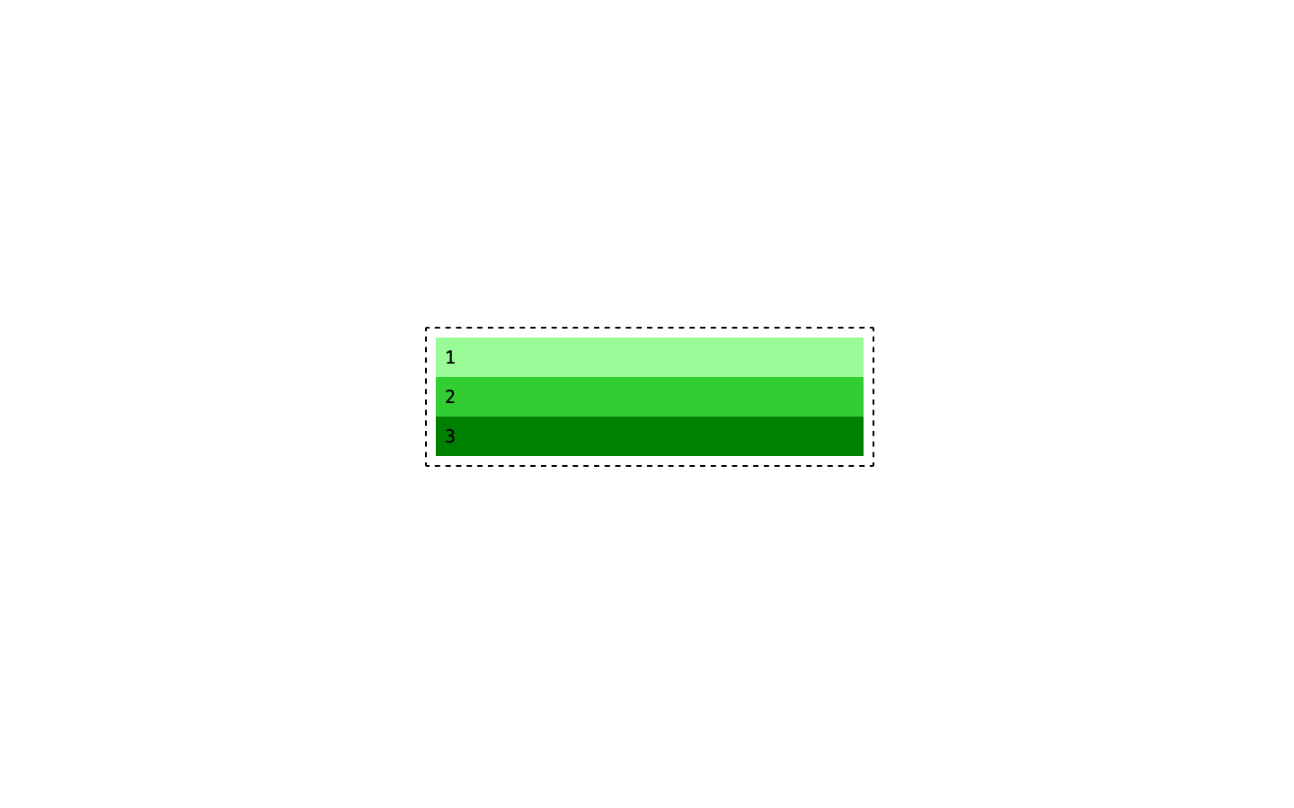
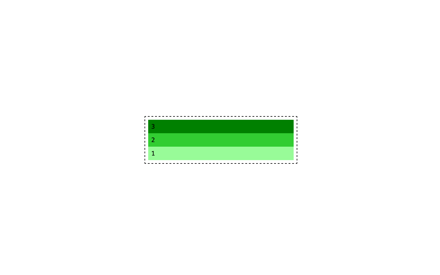
This is our starting point. I added some styling to make a bit more clear what’s happening here. The .flex-container has a dotted border and a fixed width (width: 500px)
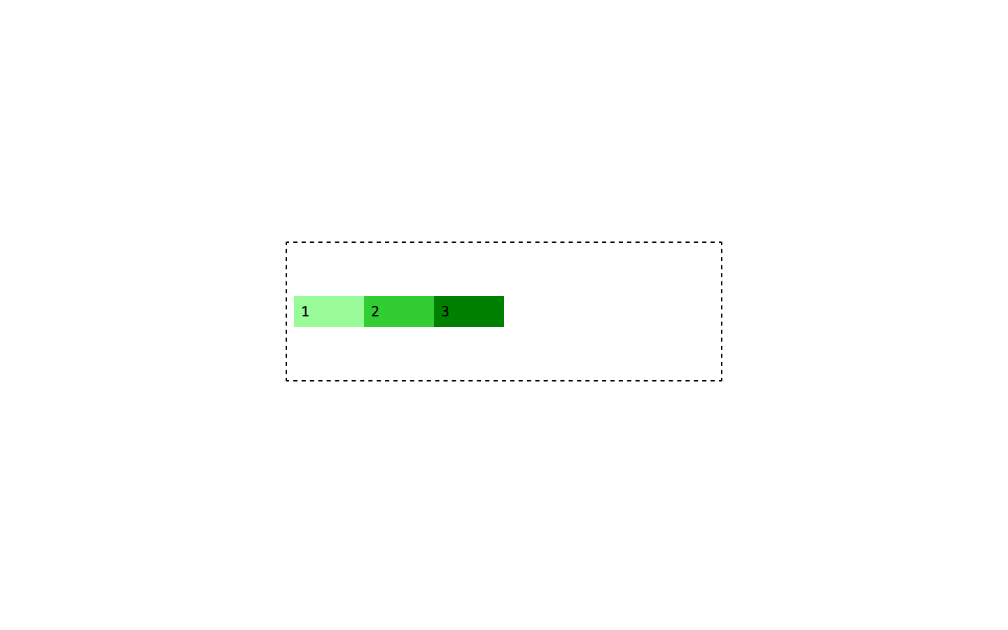
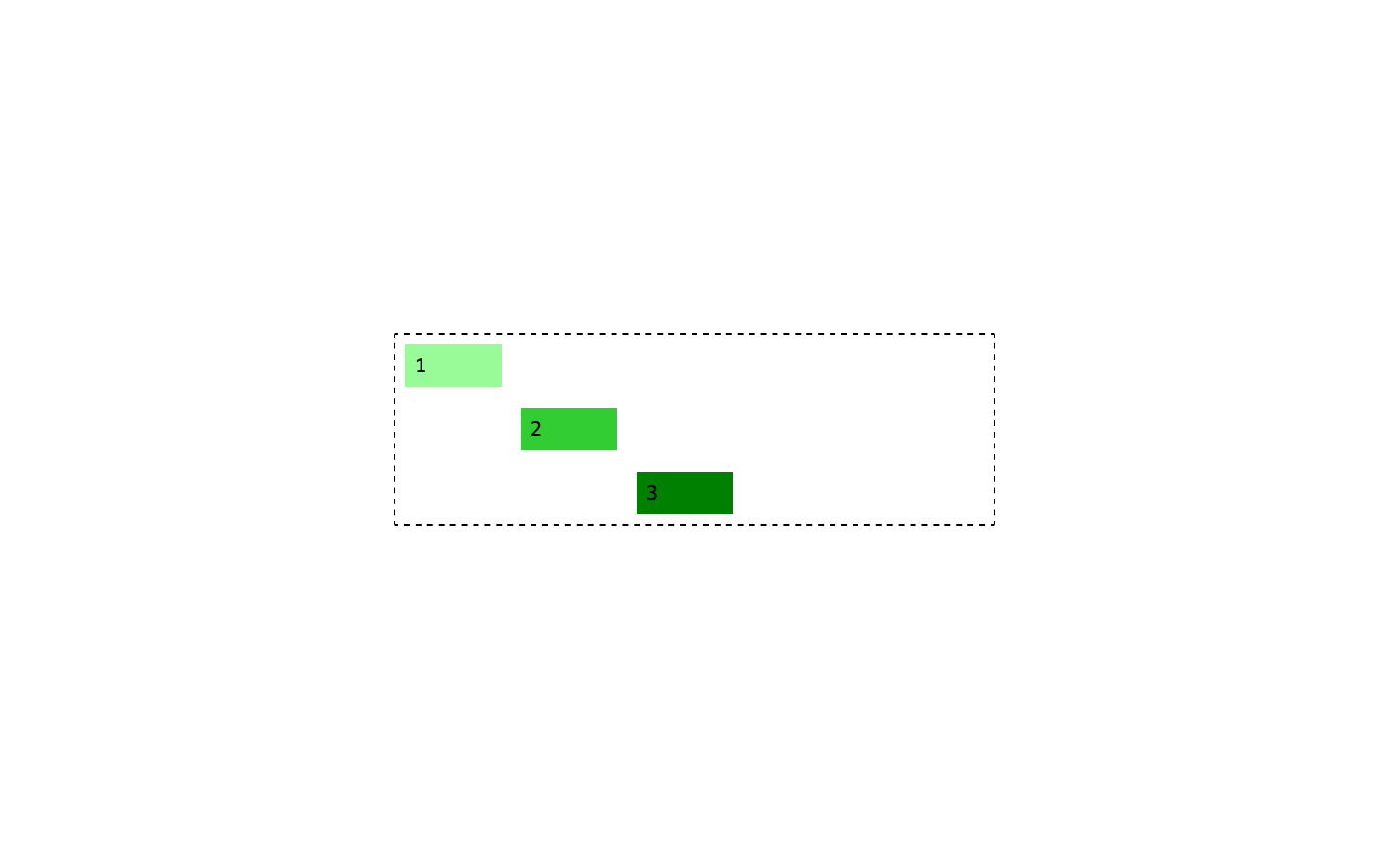
Everything is as you’d expect: the three divs are stacked on top of each other and are taking up the entire space. So far so good. Let’s transform the parent into a flex container using display: flex.
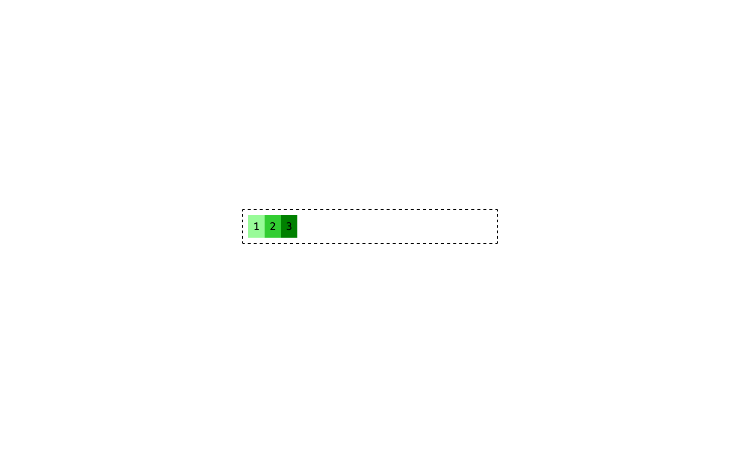
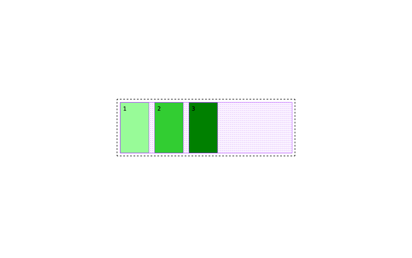
Ok, lots have changed:
- The divs are no longer stacked vertically
- They’re no longer taking up all the width available
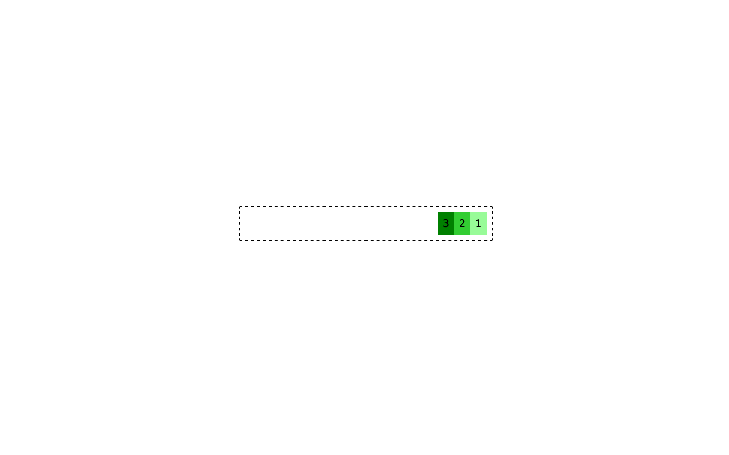
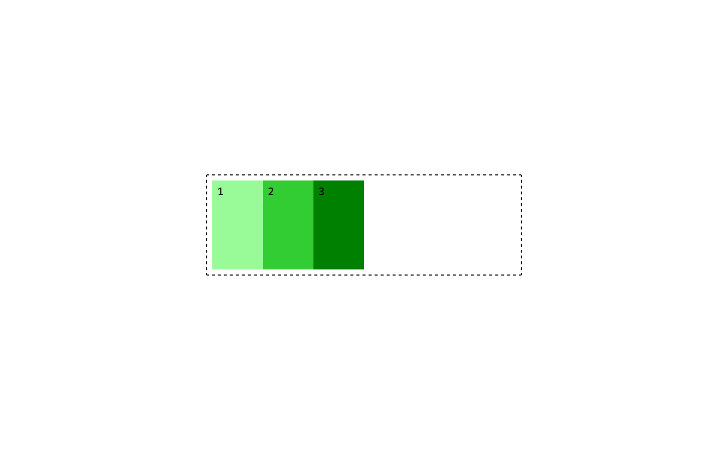
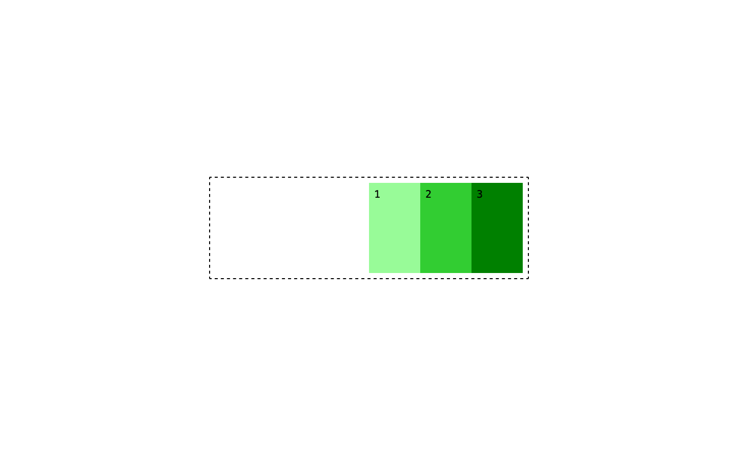
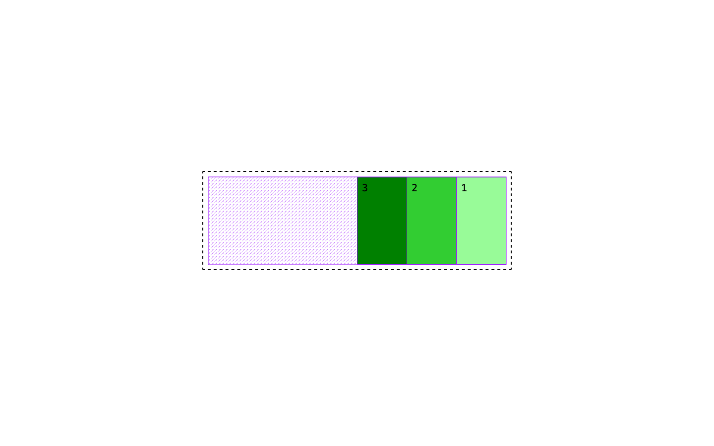
Why is that happening? The first thing to know is that flex has an intrinsic direction that controls how the content inside the container flows. That direction is controlled using flex-direction which by default is set to row. You also have flex-direction: row-reverse that does exactly what you’d expect.
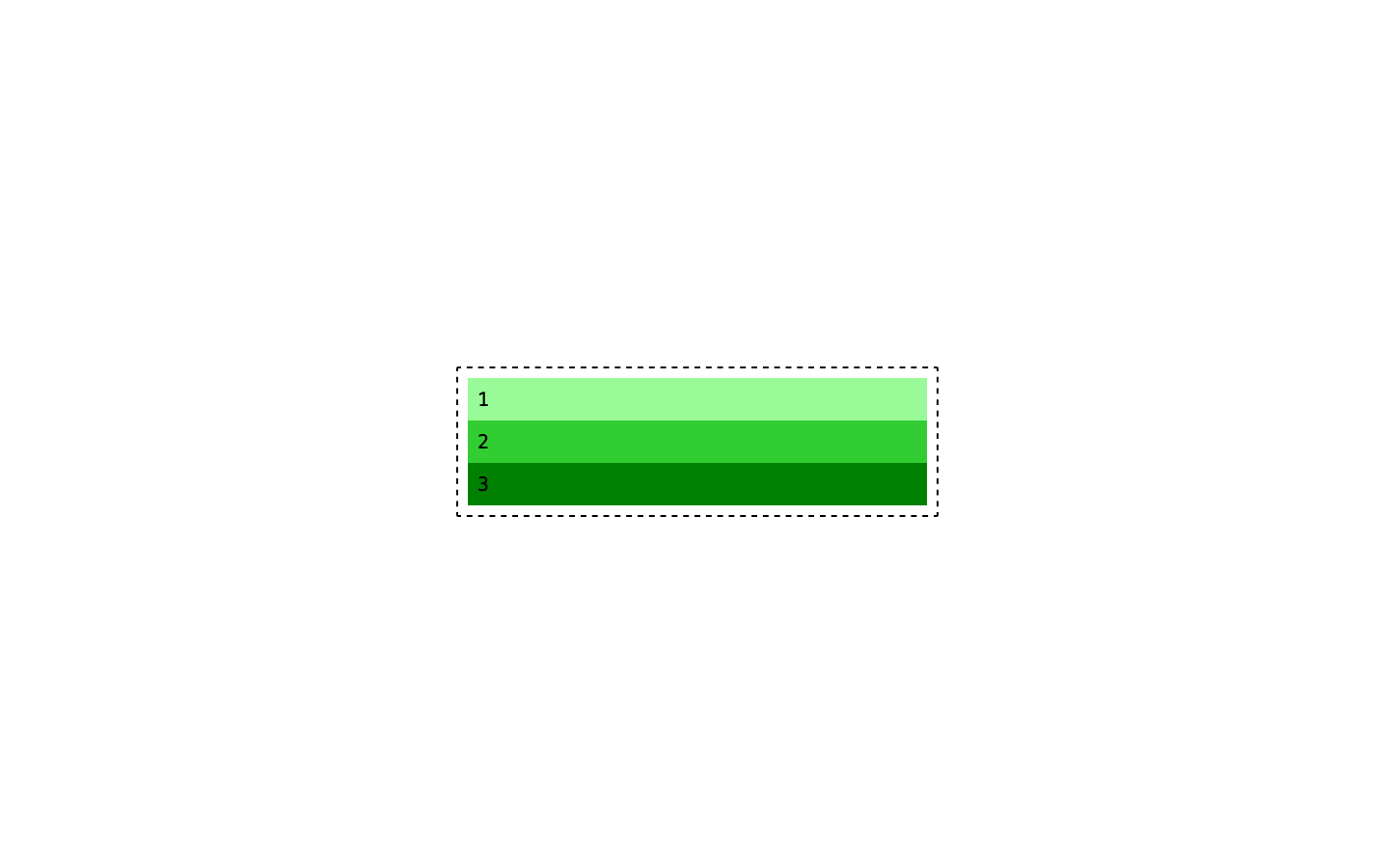
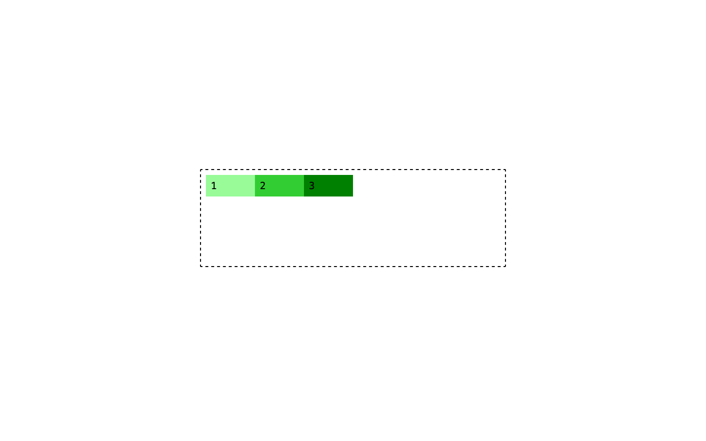
And we can also go vertical using flex-direction: column
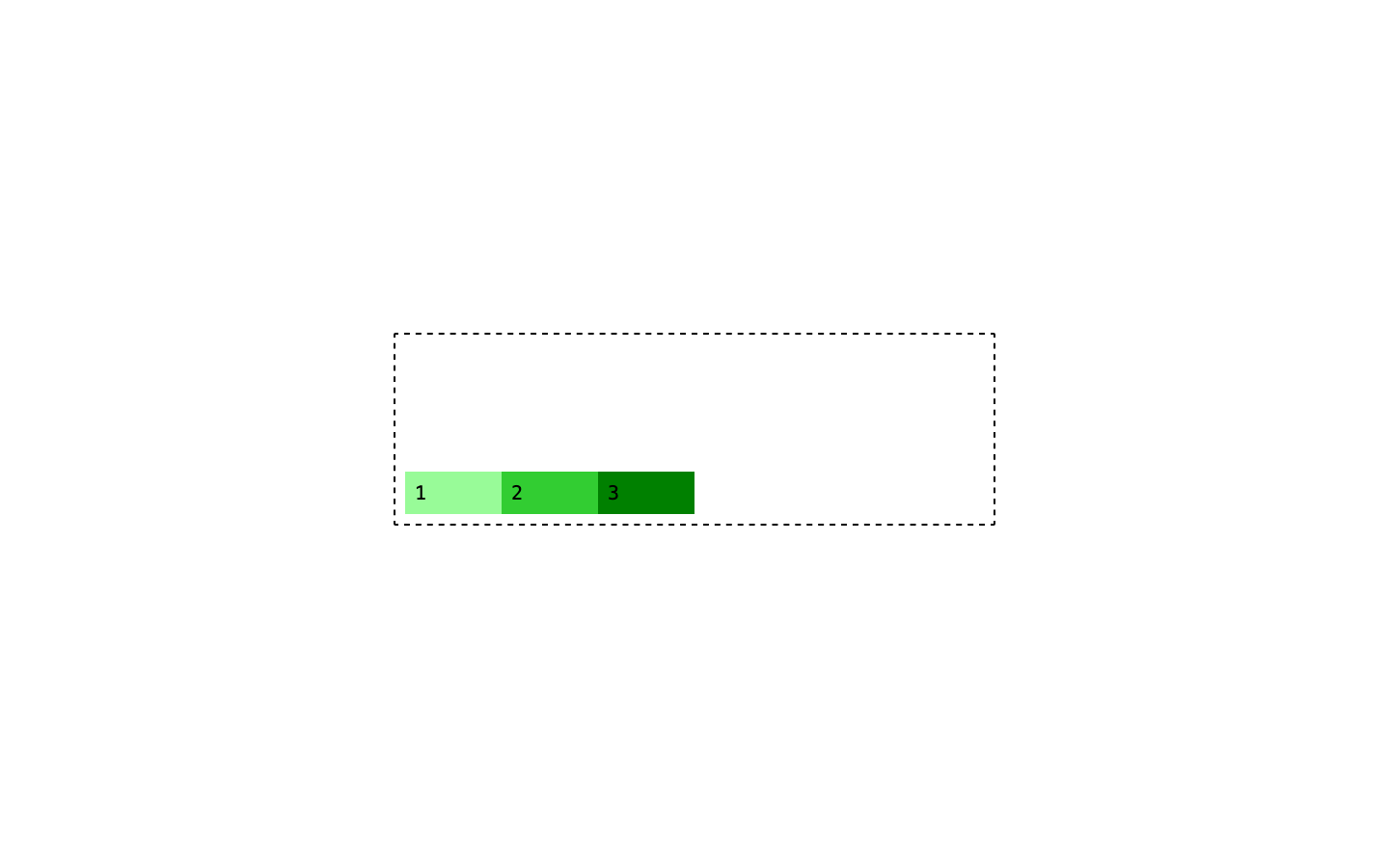
And flex-direction: column-reverse.
Another thing to keep in mind is that, by default, a flex container has only 1 row or 1 column, meaning it will never wrap around into a new line.
Ok, so we have our flex container that can align the content inside it both horizontally and vertically, now we need to do something with that content. It’s time to tackle what’s probably the most confusing part about flex and that is how to size content inside a flex container.
Flex grow, shrink, and basis
The content inside a flex container can be sized using three distinct properties:
flex-growflex-shrinkflex-basis
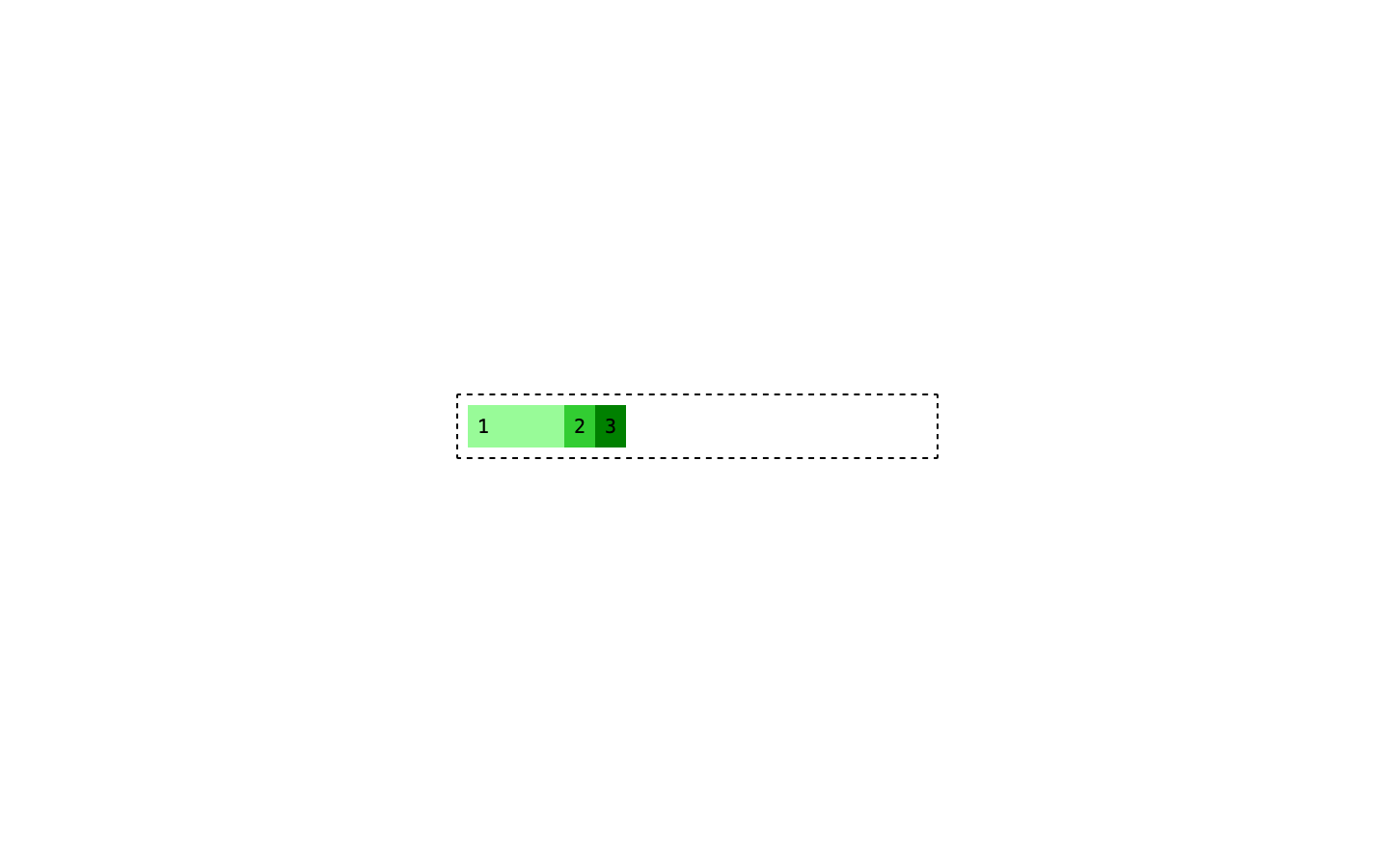
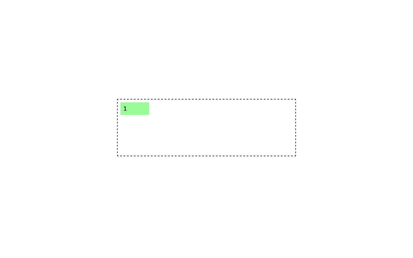
flex-basis is essentially the width of an item in the context of flex. So let’s try to apply, for example, a flex-basis: 100px to the first child.
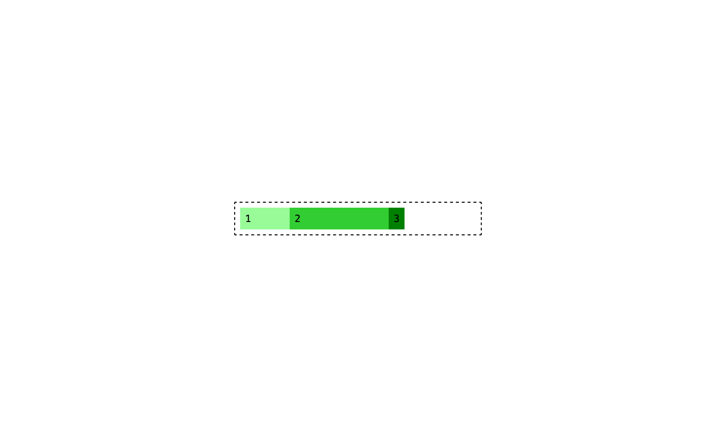
Ok, the item is now 100px wide. Awesome! Let’s apply a flex-basis: 200px to the second now.
Neat. Ok, time to do something with the third container. The first one is 100px, the second is 200px, only reasonable to make the third one 300px.
Ok, you might have noticed that something odd is happening. Our parent, the box that contains the three items, has a 500px width set. And out three containers are 100px, 200px, and 300px. That’s 600px total so they shouldn’t fit. What’s going on here?
Remember how I said that by default a flex container only has 1 row? This is what I was referring to. But we can change that behaviour using the flex-wrap property. By default is set to flex-wrap: nowrap but if you want to allow the content to wrap over multiple rows or columns you can set it to flex-wrap: wrap.
So we learned that flex-basis sets the width of an item but how about the other two properties, flex-grow and flex-shrink? These two can be tricky and I’ve seen developer with years of experience not managing to wrap their heads around how those two work.
Both of those properties accept a numeric value, and they control how an item grows or shrinks when there’s extra space inside the container or not enough. It’s a lot easier to understand with a simple example.
I expanded the flex container and it is now 600px wide and the three items inside it are all set to be 200px wide using flex-basis: 200px. 200+200+200 is 600px and so they fill all the space available.
By default, flex-shrink is set to 1. 1 what you might be wondering. 1 part of the missing space, and this is how it works. Imagine we scale down the container from 600px down to 300px.
Our three green divs are all still 200px wide and so in order to make them fit we need to remove 300px from them somehow. Those 300px are going to be subtracted from the width of the 3 divs and flex-shrink allows us to control in which proportion.
The calculation goes like this:
- First div has a
flex-shrinkvalue of1 - Second div has a
flex-shrinkvalue of1. - Third div has a
flex-shrinkvalue of1. - 1+1+1 = 3 total units
- 300px / 3 = 100px
- Each div shrinks by 100px
This is because we calculated that the value of that shrink unit is 100px and each div shrinks by 1.
flex-shrink controls the way width is subtracted from the various elements when there’s not enough space relative to their flex-basis value. And the reason why it’s just a numeric value without units is because it’s nothing more than a way to express a proportion.
If you set to elements to have flex-shrink: 1 and flex-shrink: 2, the second element will shrink twice as fast. Because 2 units of “missing space” will get subtracted to it compared to the 1 that will be subtracted to the first element.
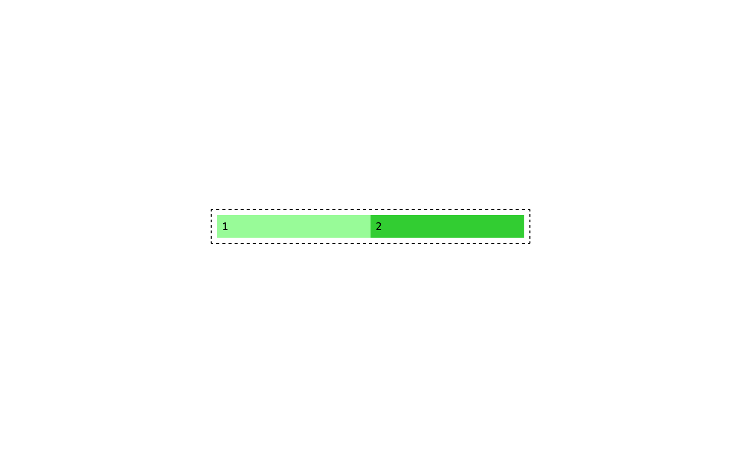
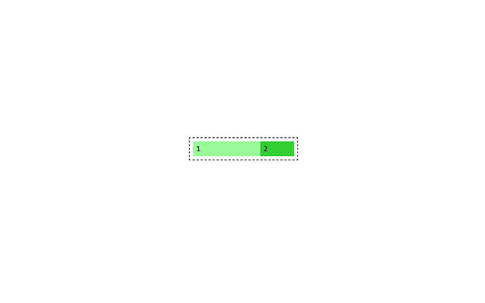
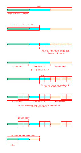
More visually, these are two items, flex-basis: 300px inside a 600px container. Number 1 has flex-shrink: 1, number 2 has flex-shrink: 2.
If I make the box 300px wide this is what happens:
Number two has shrunk down to 100px wide and number one has shrunk down to 200px wide. That is because we had to subtract 300px—our missing space—and div number two had to give up 2 (flex-shrink: 2) units while div number one only had to give up 1 unit (flex-shrink: 1)
Goes without saying that you can use whatever number you want in there, doesn’t have to be 1 or 2 you can set it to 124 and 322 and the overall logic will work the same:
300pxto be subtracted124 + 322 = 446300px / 446 = 0.67px(this becomes the value of our unit)
One box will shrink by 124 units and the other by 322.
And that’s how flex-shrink works. flex-grow is nothing but the same thing when there’s more space, instead of less. So, to keep the same example, if you have the same two boxes, both 300px wide thanks to flex-basis: 300px, one has flex-grow: 1, the other flex-grow: 2, and you increase the size of the parent container from 600px to 900px now you have 300px of extra free space. And that free space will be distributed based on the same calculation:
flex-grow: 1 + 2= 3300px / 3 = 100px(this becomes the value of our unit)
One div will grow by 200px, the other will grow by 100px.
And this is all for part 1. Next time i’ll cover the ramaining properties but I think this is the more tricky part of flex because sizing inside a flex container can be confusing.
@cosy_diner let me know if this has helped in any way and especially let me know if you have questions!
