Hello! I am having a problem I’m not sure how to solve. I am working on my links page, and I have a sidenav bar in that page. The padding was displaying perfectly until I added my border-image. this is the first time I’ve used border-image and I’m not sure whats causing it to shrink so much inside. I linked the page above for people to inspect, and also here is the css code I added to my nav element:
I spy some familiar faces here. Thanks for the kind words about my site!
Border-image isn’t something I have personal experience with, but from looking at your code, the first thing that jumps out to me is that you have border-width set to 70px. For a border, this is huge. The huge border is squishing the whole element inward, and in combination with a lot of padding and a big font size, there’s not much room left for each letter.
Here’s what I would recommend you try:
Drop the border-width significantly. Do not go higher than 20px. If you were using a higher number to counteract the distortion of the border image, try changing the proportions of the original image.
Ditch all padding for the nav element.
Change overflow: scroll to overflow: auto.
Lower the font size. Note if you want to do this without affecting the font size for other elements of the same class, you can wrangle that a few different ways.
You can use nav li a as a selector for your navbar links, without needing a class name.
If you change your section headers from paragraph elements to h2 elements, you’ll have what would be considered more semantic HTML that’s better for screen reader navigation, and in your CSS you could use h2 itself as a selector, as well.
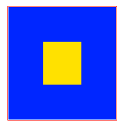
ah! while box-sizing: border-box is usually very helpful, in this instance it is troublesome! often the case with frame-style border images, since it feels like they should behave more like a background image…
here’s a visual demonstration since it’s a little hard for me to articulate verbally! your nav’s width is 220px; represented here in red. box-sizing:border-box means that this includes the borders, no matter how big those borders are - in this case, they’re 70px wide! here in blue.
the div is dutifully staying 220px wide, including the borders… this leaves you with only the space in yellow for the “inner content” of the div! (border-image-outset isn’t doing anything here because of the border-box rule, i think; if you turn off the border-box rule it becomes a different type of silly.)
the “inner content” of a div can’t go on top of the border, only inside of it. so with a 70px border your div essentially has 70px of mandatory padding on all sides on top of whatever other padding you add inside!
shrinking your border-image-outset and border-width and tinkering with the div’s width should help some without sacrificing too much style; this is it with width:280px; padding:5px; border-image-outset:0px; border-width:50px for example!
there’s a bunch of different ways you can work around this but hopefully this helps you understand what it’s doing so you can decide what you want to do!
Thanks everyone for your input!! I looked at the messages I got and fudged around with the image and the code until I got to a point where I feel like its looking good.
Heres what I did:
edited the border-image itself to be closer to the final shape
while messing with the border-width, I tried setting it at 0px, which seemed to fix alot of my problems? I am not sure how, lol
changed to overflow: auto;
lowered the font size of the nav buttons & removed the boxes around them to allow for more space
changed my section headers to h2 for better semantic html (thx coyote!)
I put everything thats in the nav bar into its own div wrapper so that I could add padding to the nav to edit the scroll overflow cut-off so its not in a strange place(you would only notice this if I get enough “sections” to go past the max-height I set)(this was not working with just the nav by itself, it would change the size of the nav)

