I love browsing through websites and checking out the load of gorgeous places that exist out there, but the huge wall I’ve hit on making my own is responsiveness.
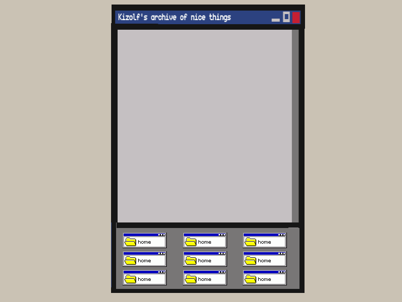
I do have a website! It’s just that… it’s a wall of links. And don’t get me wrong, I love my wall of links very much, but I’d also love a place to write, to show off my drawings, and to call “home”, cause right now I have a porch. But, being the perfectionists I came to realize I am, I have a condition: I must be able to see it both on monitors and on cellphones. My porch was tailored to work on my monitor and my cellphone, so when other friends opened it, their huge screen made it clear that I had no clue on what I was doing in terms of upscaling it; nothing that a zoom didn’t fix.
Now I have an idea I want to make happen, I did a drawing of it and it is based of a layout I liked a lot that isn’t responsive, my only reason to not use it (nor any other of Teppy’s layouts).
Am I being too demanding with myself for trying to make my first and second projects responsive? Or being too picky with the layout not being responsive? Or even should I double down and learn how to make stuff responsive right now?!
Hi there. Looking at the example provided and the screenshot mockups, I figure you could make this happen pretty easily with a simple media query. Have you used those before?
I know it exists, I’ve tried using them here to make a navigation bar, but that’s the best I’ve done! Came to know it way too late and still don’t know how to use it right, but I’ll go find some tutorials~! Thank you!!
i don’t think it’s too demanding! this is a great example of something which seems like it’ll be hard, but broken down it won’t be too difficult i think. media queries are not as hard as they might seem at first glance, & this is a great usecase for flexboxes! (my favorite!)
here is the flexbox guide i use all the time; at the bottom they have examples that include this flexbox layout, which i think would be really helpful reference for your plan! tinkering with the example should help a lot with getting where you want i think. (delete one aside and the footer and you’re halfway there!) i find tinkering with existing simple code really helpful for understanding how things work personally.
I’ve used flexbox for all of my first website after rewriting half of it with grid, and yet I still didn’t got used to it enough ;u;) but it is great to have a base to work on!! Thank you so much!!
Also somehow I didn’t think of using both media & flexbox together XD
Yeah, seconding @xixxii, I think a media query with flexbox is a solid way to make this kind of layout responsive. You can set up a change in flex-direction from flex-direction: row to flex-direction: column-reverse (or vice versa, row-reverse to column) by wrapping one or the other in a media query, e.g.: