Recently it was brought to my attention that my website’s color scheme doesn’t have enough contrast, particularly with the links, which can be hard to see. I spent some time on WebAIM trying to figure out some minor modifications to the color scheme that would fix this, but I found it quite difficult to find shades of black, red, and grey that had sufficient contrast ratios. So I took the next logical step and scrapped my whole site design and started over.
With my new layout, I am trying to capture frutiger aero vibes, like Windows Live Messenger circa 2010. I’m looking for feedback on the design, so if you have some time, please take a look and tell me your thoughts!
Specifically, here are some things I’m still unsure of:
The color scheme - I really like the blue background, and I think the light grey of the main content is fine, but what I’m unsure of is the text colors. Black text with blue links is very plain, but it is also very readable.
The sidebar - I generally like the look of it, but I feel it needs a little bit more stuff in there. I could do some 200x40 banners or something, but those are probably better suited for the links page. I also think a more interesting background on the sidebar would be good, perhaps just at the top. I’d love some ideas here.
The typefaces - I think the fonts in the header are kind of boring and I should maybe look for a font(s) that is a bit more interesting to offset the main content fonts, which are more straightforward for the sake of readability.
The links page - The three column layout works really well in my wide design that is currently live, but with the narrower body here in the redesign, it looks squished. Should I switch to two columns? Maybe I should rethink the whole page?
These are the areas I have been focused on but I would appreciate any and all feedback you may have for me. Thank you all!
Consider adding underlining to your blog post headers(and links in general) and css-powered capitalisation. When I looked at it, the lower case titles and the colour just looked like a header colour, not a link.
You could make it collapse/expand. I do a meh example of this on my site for the sidebar. This way your body text takes almost the full space.
Consider not using a monospace font. These have bad kerning which harms readability. I think you’re mixing sans serifs and monospace? Consider using the same font except for places you want to direct attention to.
I think it looks fine. Maybe increase the left and right margins, and increase the width to accommodate them? The squished look is probably because of the thin margins.
I’d also suggest moving the last updated text somewhere else. The current footer isn’t easy to read.
I can see how the blog post headers could be confusing without the underline. Do you think the color is not enough to make the regular links stand out from the body text?
The lower case titles were done through CSS text-transform. I thought the combination of the lowercase and a different font is more visually interesting for the headers than using properly capitalized Noto Sans, but if it’s unreadable it definitely should be changed.
For this, do you mean the margins for the page content in general, between each column, or inside each detail box?
This is on the page so I can read the date element with JavaScript. I’ll just hide it from rendering.
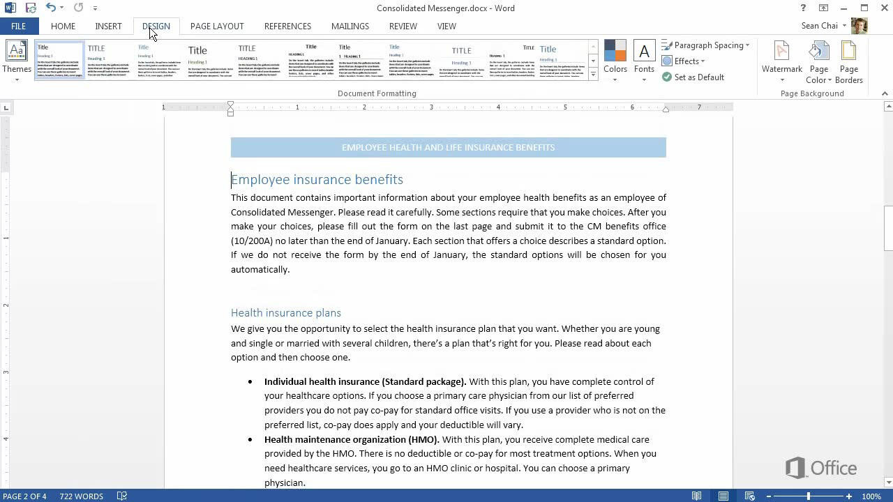
It’s not that it doesn’t stand out, it’s that it looks like a header colour. Here’s an equivalent example from Microsoft Word where this is default. It does stand out, it just doesn’t communicate that it’s a link.
It’s not unreadable, it just doesn’t look good. You can only make a monospace font look so good, because it’s fundamentally limited by the monospacing which means you get bad kerning(this is the spacing between letters). This is why it’s rarely used in design except to produce a “hackerman” feel, which Windows XP-style aesthetics are pretty far from imo. If you’re going for visual interest there’s other ways to do this like shadows, borders, text decoration. You could even mix images with it or font awesome icons
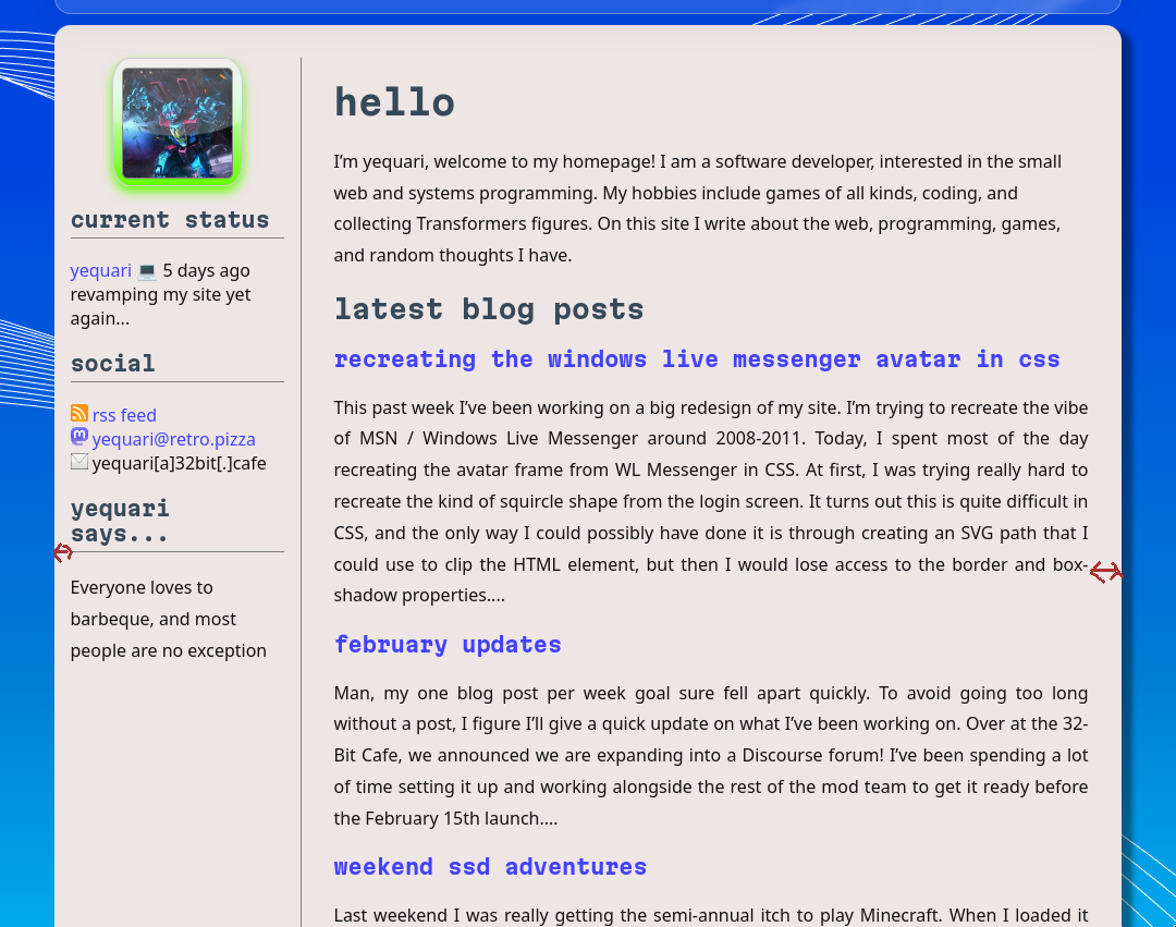
I marked red arrows for this since idk how to express it