These last months I’ve been struggling on keeping a design/layout on my website. I’ve always been indecisive, so my idea is going more minimalist, however I’m still not happy with the current design, could anyone suggest me ideas? I’ll be really grateful!
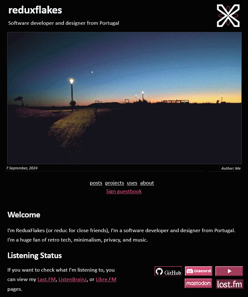
the logo looks a bit lopsided next to the links array as-is; maybe center-aligning the text to the image or making the links a vertical list would help? but it’s conveniently just about exactly the same height as your title + subtitle so i think it looks nice aligned with it like so! ^
i shrank the photo caption a few sizes so it doesn’t pull focus/call attention to itself, and moved the links. also moved the “sign guestbook” link so it’s with the rest of the navigation, so it feels a little more eyecatching.
i recolored the button links to match the color-pop link color - i think enforcing a more limited color palette helps with a streamlined minimalist look! less to look at. it helps the buttons blend in better and feel like one “group of buttons” element rather than five individual pieces, also, which reduces the impression of visual clutter. also i scooted the buttons over a bit and right-aligned them; their current positioning isn’t aligned with the edge so it looks a little “free-floating” when it could be a bit more “tidy” i suppose.
just my two cents! i think it also looks just fine as it is. redesigns are tough; it’s hard to tell what looks wrong because i’m unsatisfied and what looks wrong because it’s just different haha. hope that helps a bit!
from my own experience with indecision on designs, it’s been both an experience of excitement and frustration - excitement at the idea of coming up with a completely new design and make things different every so often, and frustration that i can’t just be happy with something for a long time.
less functionally and more in terms of mindset, i think it’s okay to keep changing and finding what you like and don’t like about a layout’s design. you never really know until you try, and even when you do there will be things you find you like and dislike that may make you itch to have a new one. but it’s part of the learning process, i think - in that you’re learning about yourself, what you want, what your tastes are like, and what you think you can to do improve. and much like the learning process of anything else, you’re always growing and learning more and changing.
in a slightly more practical way, i’d also suggest asking yourself the following questions, especially when you look at these sites that you like:
what do you like about them? do you like a banner more, or do you like the immediate text instead? what are the specific elements do you like from each of these sites, and in the same way what elements do you not like?
what’s the first impression you want to leave on visitors when they see your site? not reading or absorbing it yet, just with a mere glance? personally i’ve always found it useful to have at least an idea of a ~vibe~ if not a visualization yet
how do you want to share the content on your website? in the same way, how do you want it to be experienced?
from a visual standpoint, it looks like you prefer: one column, white text on black backgrounds, and emphasis on text with large images as accents. i think that’s a lot to go on already! but the thing about these other websites that you like and yours is that your website is still yours. so my last question would be: what decision can you make on top of these designs that inspire you to also make the visual design of your website uniquely yours?
i hope this helps (and sorry or no worries if it doesn’t)!
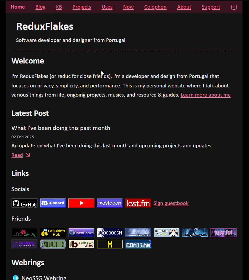
I really like it! I think the pink on the black background looks good. And you choose a good black just a lil bit lighter than pure black. I also struggled with choosing a layout, but I think what helps me is to just use my site regularly with the layout I have and seeing if that helps me realize any struggles I’m having with my current layout. Like I originally had one column layout with a top nav, but as I started adding more links, I realized it wouldn’t work for a website with a lot of navigation links, so I opted for a two column instead.
Thank you so much, you didn’t need to do an actual redesign but I’m really thankful!
I do agree that the new design appears to be much more balanced. I was thinking of moving to a 2 column layout or have the navigation in the footer and have an hyperlink at the top to target the navigation at the bottom.
Thank you! My design is closely related to neue haas grotesk and swiss design so yeah dark backgrounds with white sans-serif text or vice-versa. What I like from the sites I linked is the way they structure information and how minimal they are.
Ty! Yeah I made sure not to have an actual black background with pure white text for accessibility reasons. I might try messing around with the layout a bit more and get inspiration from other sites that I like that don’t follow a minimal design.