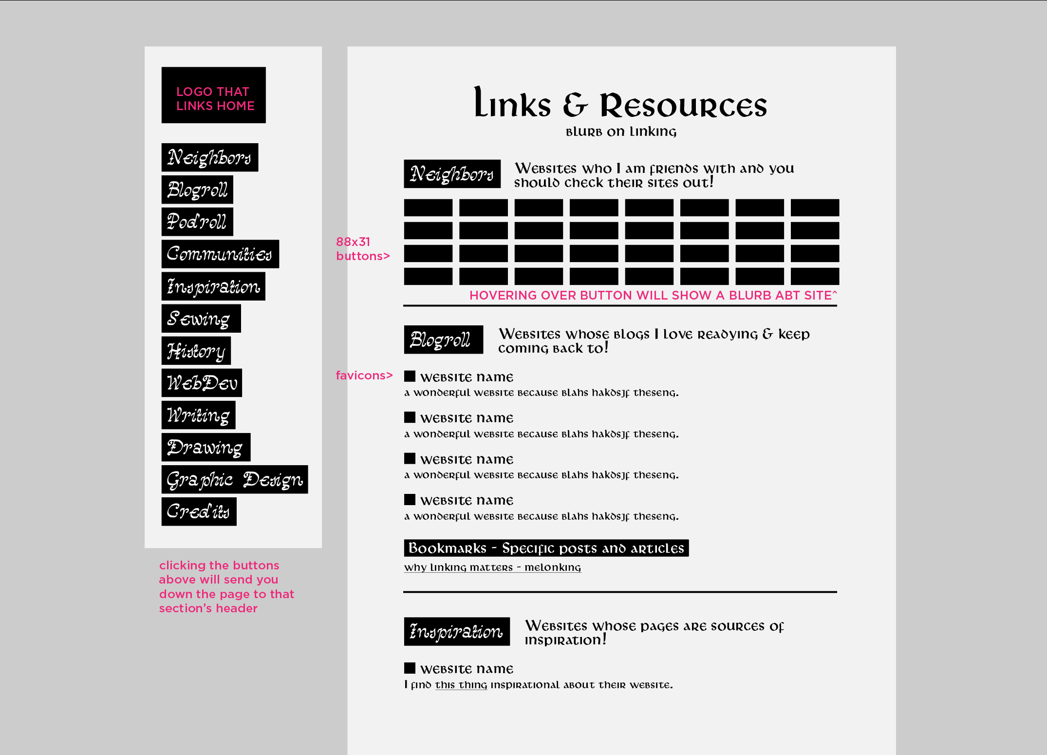
Hello! I have been working on a rough wireframe link page for my website, and because It will most likely have a lot of links I want to try and make it as easy to navigate as possible.
my current design has category sections which you can navigate to quickly with the sidenav buttons. (they would send you down the page to that section’s header)
My question is whether or not I should have little arrows next to the actual headers that send you back up to the top, or if there is a better solution. I considered having the nav bar follow the user down the page (fixed positioning?) but I think i might run into problems if the amount of sections becomes larger than the screen.
(btw all copy is placeholder) I am open to feedback and advice! This is just a wireframe so I can completely restart easily if this version doesn’t work out haha. Thanks all!
You should mock it up functionally and see how it feels.
Personally, I think if you’re going to have a link that brings the user back to the top, it should be at the end of a section, not on the heading itself.
i personally prefer having the nav on hand, so i like a fixed position navbar for something with a lot of sections! you could just make it scrollable if there’s more categories than screen height. having a scrollbar-width:thin; can help keep it from feeling too clunky or like the scrollbar is taking up too much space!
i personally have separate links pages for “resources” and “fun links” to solve the too-many-categories problem lol. it’s more inconvenient for visitors, though, which is not what most people are going for.
I like the sticky nav bar idea! If you’re worried that the number of categories might exceed the height of the viewport, you could consider using accordions to group similar categories together under a few broader categories (see this example). Or, like xixxii says, just make the entire nav bar scrollable.
Are you planning on making this responsive for mobile as well?