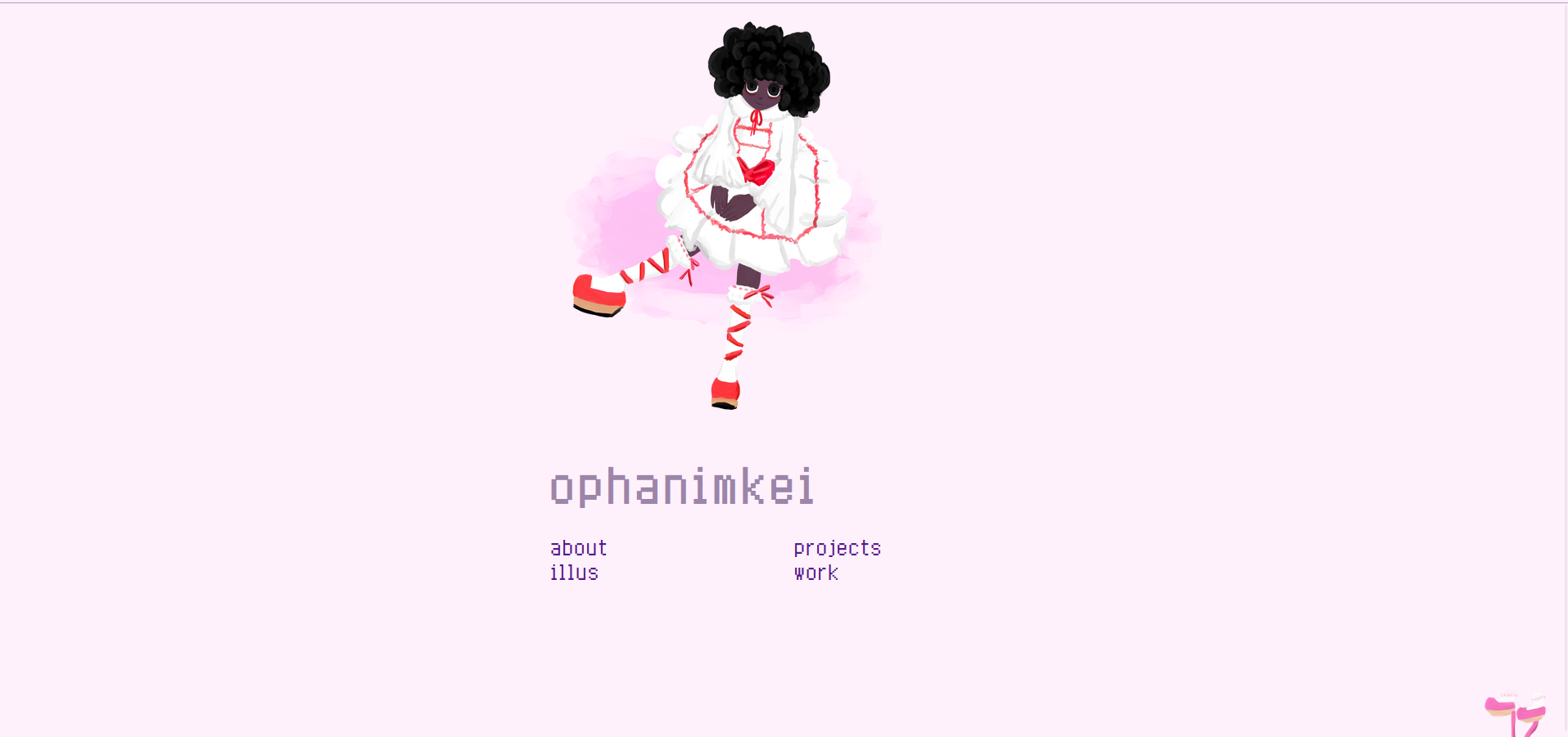
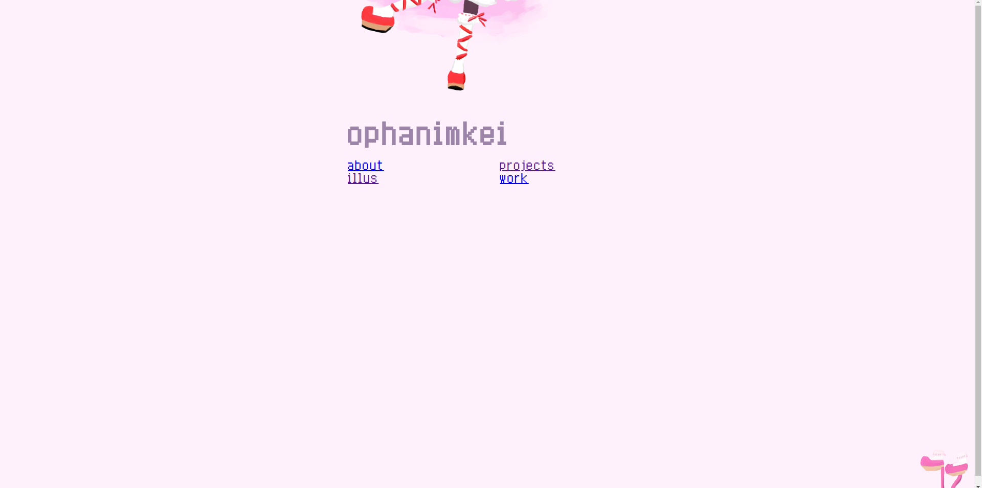
I’m trying very hard to fix my portfolio on Chrome but nothing is working. I’m having a few issues:
-
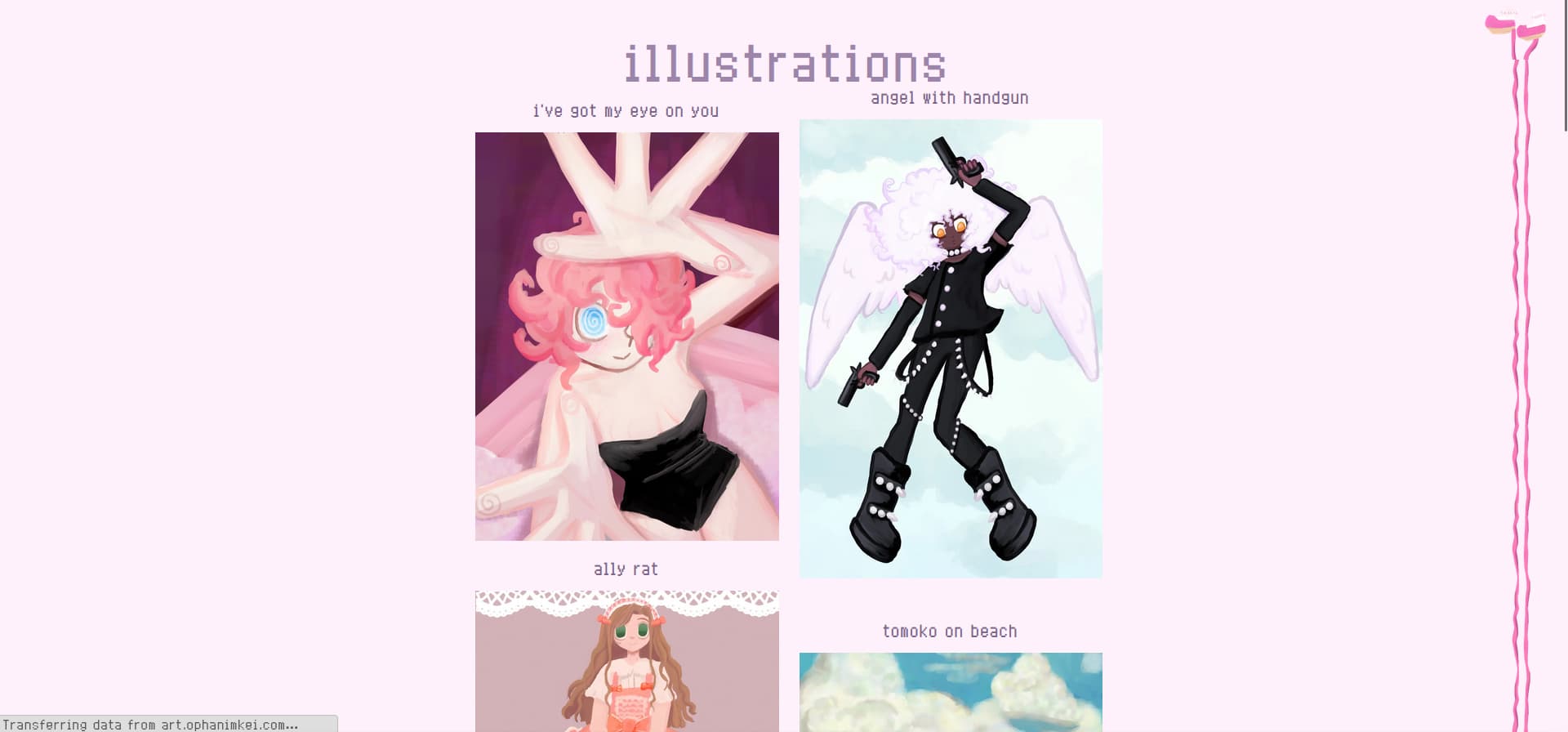
The shoes in the corner are misaligned with the endless ribbon on Chrome depending resolution. No idea why this is. It works fine for me on safari on Ios and Firefox. It just doesn’t work at my default resolution on Chrome, but when I go into Chrome’s dev tools and test at various sizes, the ribbon and the shoes are aligned.
-
The entrance image is just…halfway cut off on Chrome. Attempts to fix it have all failed due adjustments on Firefox and Chrome not being the same. 20% down the page on Chrome is perfect, but way too low on firefox.
I’m really frustrated.
If I understand correctly what you’re going for, try going with width: 100%; instead of width: 100vw; in your #shoes declaration. A value of 100vw represents the width of your page including the vertical scroll-bar (if it exists), whereas 100% will not include the vertical scroll-bar. I think that’s what causing the misalignment.
As for the image being cut off, maybe try applying display: block; to the entrance image? It’s a little tricky to debug this without knowing what you want the page to look like though or without a screenshot of what you’re seeing—I was unable to reproduce the image being cut off—so I may be off base with these suggestions.
Edit: Actually, I think I understand what you want the shoes and endless ribbon to look like. This might work for you:
#shoes {
  overflow: hidden;
  z-index: -1; /* layer below everything else */

  position: absolute;
  top: 0;
  right: 1em;
  width: 96px;
  height: 96px;
  background:
  url("art/rhs1.webp") bottom 0 right / 96px no-repeat, #fff1fc;
}
And if you want to get rid of the vertical scroll-bar when the content is not taller than the viewport, you can remove the margin on the body:
body {
  min-height: 100vh;
  margin: 0;
}
Thank you. I’m realizing I should’ve provided images with my question. On firefox, it is perfect, so I’ll porovide images from there.
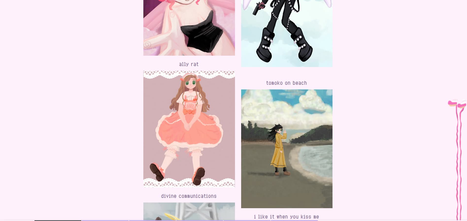
On Chrome, it looks like this
When I try the code you provided, it’s closer to fixing the issues on firefox, but the shoes are at the top of the screen and the ribbon isn’t aligned perfectly with the shoes… Though I kind of like it at the top like that.. I just wish I could figure out why it’s misaligned
Sweet! That helps a tonne, thanks!
1. For the entrance image, I believe the issue is the height declaration on the .entrance class, height: 4vh;. If I remove that, the image isn’t cut off at the top anymore.
2. The shoes and endless ribbon alignment is a bit trickier, but I think I’ve found the issue: the top of the ribbon image is aligned to the top of the page, so the first 96px of the ribbon is behind the shoes, but I know what you want is for the bottom of the shoes image to be right up against the top of the ribbon.
If you still want the shoes aligned to the top of the page, then you’ll want to change the background declaration on the body to the following:
body {
  background: url("art/rhs2.webp") top 96px right 1em / 96px repeat-y, #fff1fc;
}
If you want them aligned to the bottom of the page as you had originally, however, keep the background on the body as it is:
body {
  background: url("art/rhs2.webp") top 100vh right 1em / 96px repeat-y, #fff1fc;
}
And change the height of your #shoe element to be 100vh:
#shoe {
  height: 100vh;
}
Hope that solves things for you!
Apologies for not getting back to you! I’ve been abroad and hadn’t opened my laptop in quite a few days. I was able to try the code today, and it fixed everything. You are a lifesaver. Thank you so much! And thank you for the thorough explanation!