Hey team. I like to change my design yearly; you can check past designs on my website history page.
It’s about that time of the year again. I’m working on a new design for 2024, but I’m stuck on whether I should switch up my colour scheme, so I’m reaching out to the community to see what you all think.
Yes, change the colours
No, I like the current colours
0voters
I may or may not use the results of this poll to influence my decision for the new design.
personally i am very pro-orange so i say keep the orange! maybe it could use a touch of another complementary color in there to mix it up just a little bit?
Thank you! I’m also loving the orange at the moment. I’ve tried with some greens and it doesn’t seem to fit my style at the moment. Which is something as I’ve never had orange feature on any of the previous designs…
I’m definitely looking at some secondary and accent colours to spice things up.
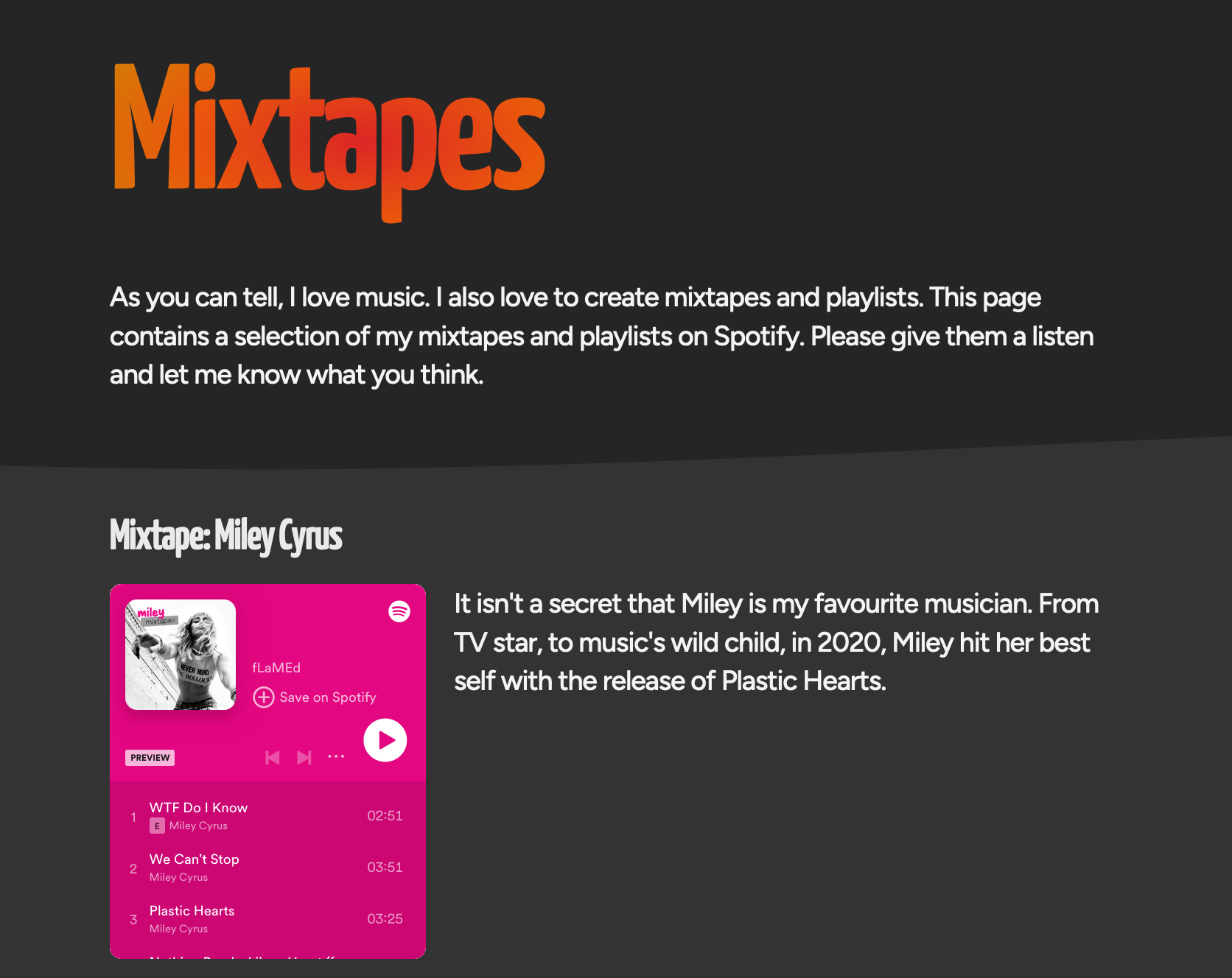
i like the way you have the album art displayed next to the info, and the page is overall very tidy, but it is long…maybe since you have several instances of “multiple albums from the same artist” grouping those in some way could condense the info a bit? my first thought was tabs or a collapsing/expanding list🤔
How about an album art grid similar to my bookshelf page? A popover <dialogue> box displays the info when an album is clicked.
The website will largely remain the same.
I’m looking at changing the homepage layout, and exploring individual page layouts with how information is presented.
Oh right! On the home page, where I have the orange banner and FLAMED FURY I want to do something graphical there. 2000s style photo shop blend and smudge type thing.
Finished most of the back end changes, in the process of porting over the API calls now and I’ll be done and can focus on the graphical elements.
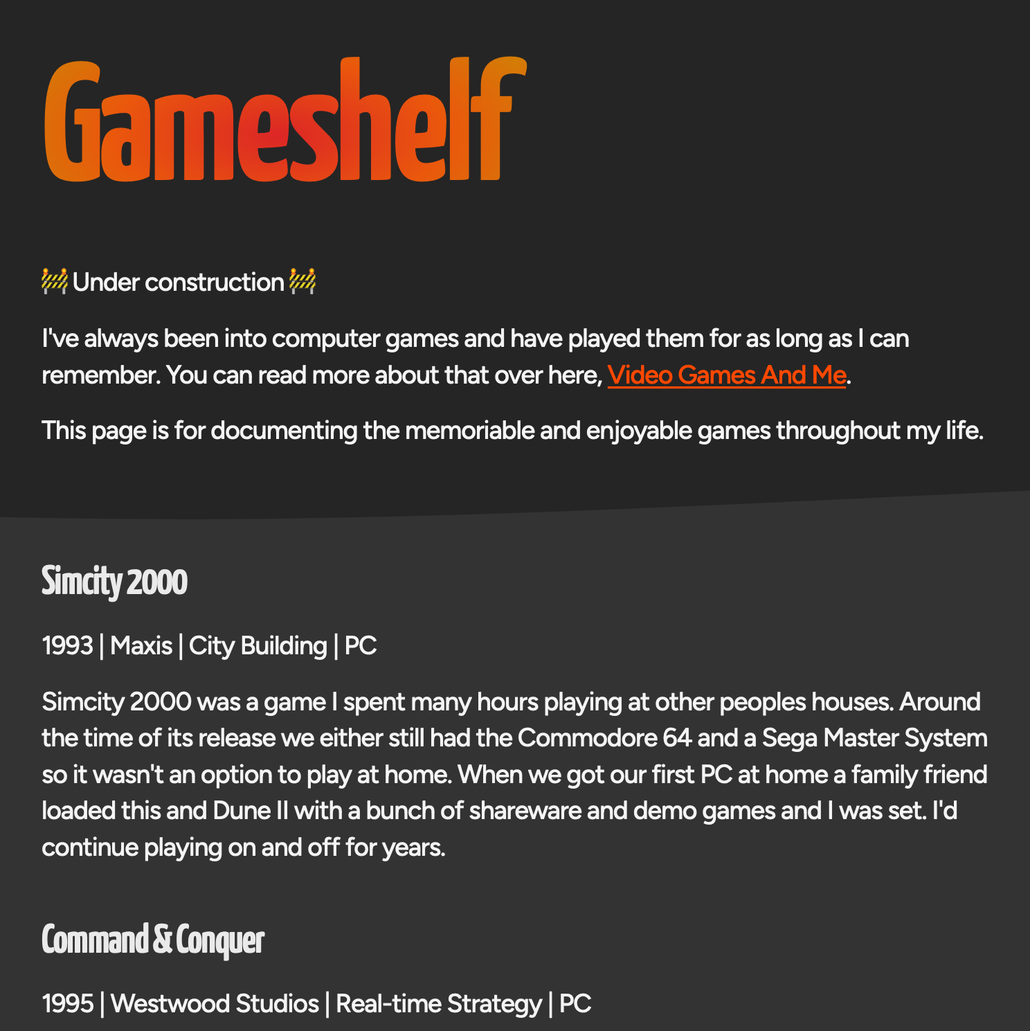
However, I’ve been distracting myself with exploring what some of the “under construction” pages from the past few years might end up looking like. The [Gameshelf}(Gameshelf) page is just a bunch of lists at the moment…
Change for the sake of change alone is perhaps not great, but there’s something about change on a website to me that is really nice. Kind-of like emitting the signal: “Hey! This website is alive!”. Now, too much / overhaul change, maybe not, but colours? Totally! Go for it, yo!